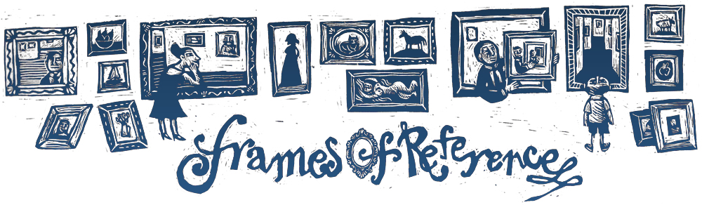
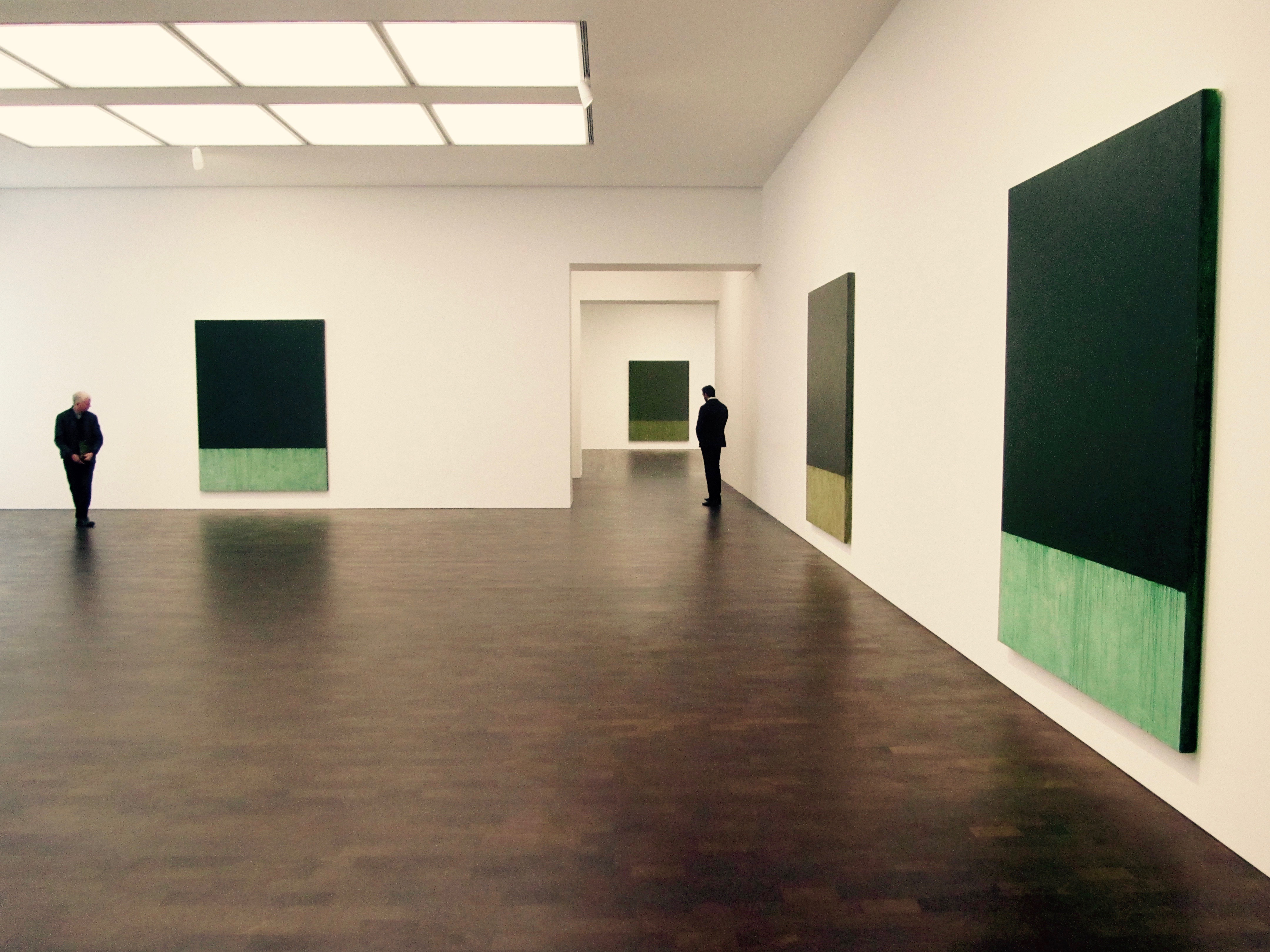
Eastern Moss is a nine panel painting by Brice Marden in nine variations of terre verte (green earth) pigment. It was the first painting we met when we visited his recent exhibition at Gagosian in London.
I kept putting the same colour on – the same colour, the same colour – but every time I put it on it was different. Each time it was this whole new light/colour experience. It was not a revelation, but a whole wonderful new experience… To me, it involves harnessing some of the powers of the earth. Harnessing and communicating.
Old Holland
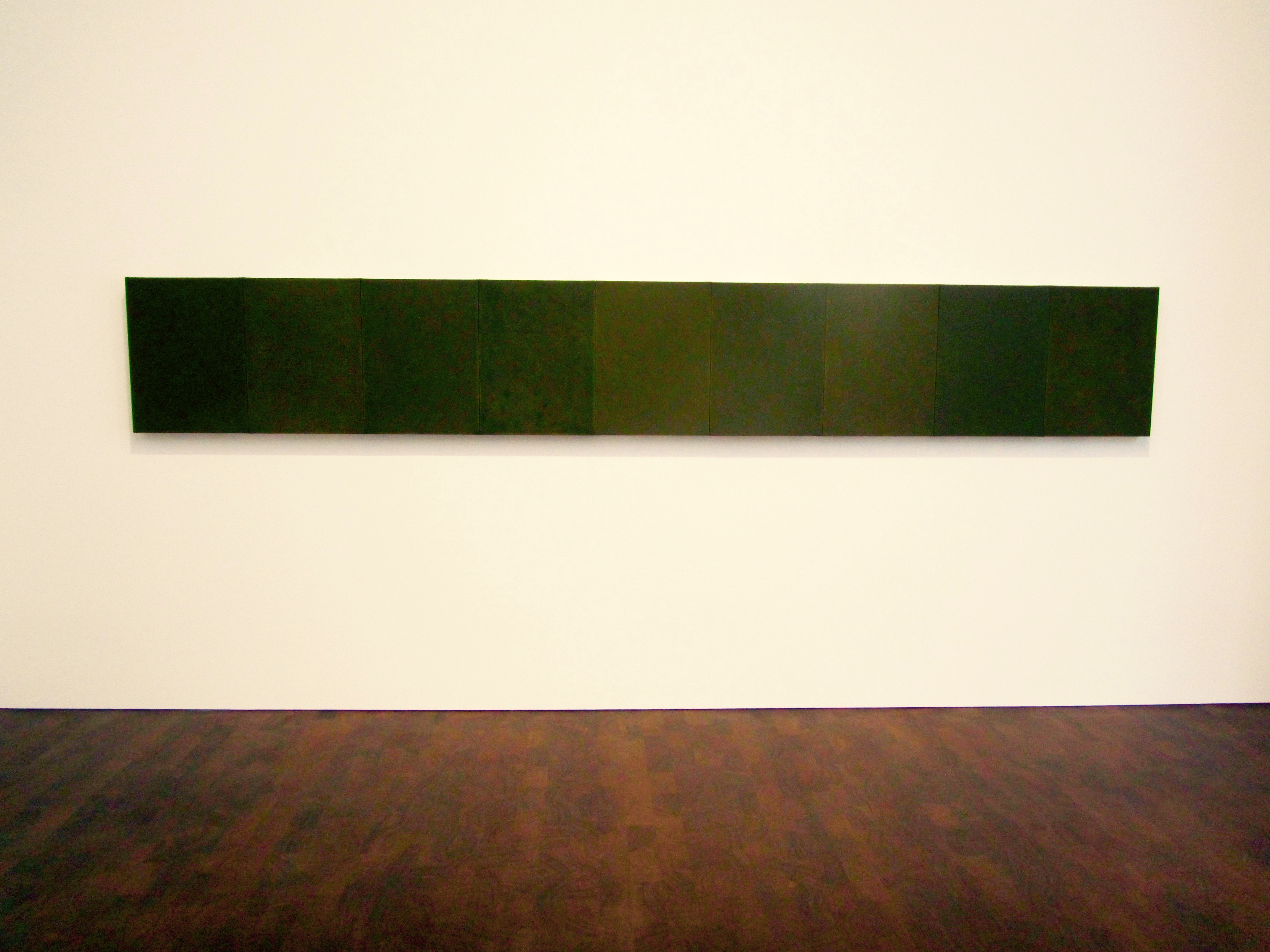
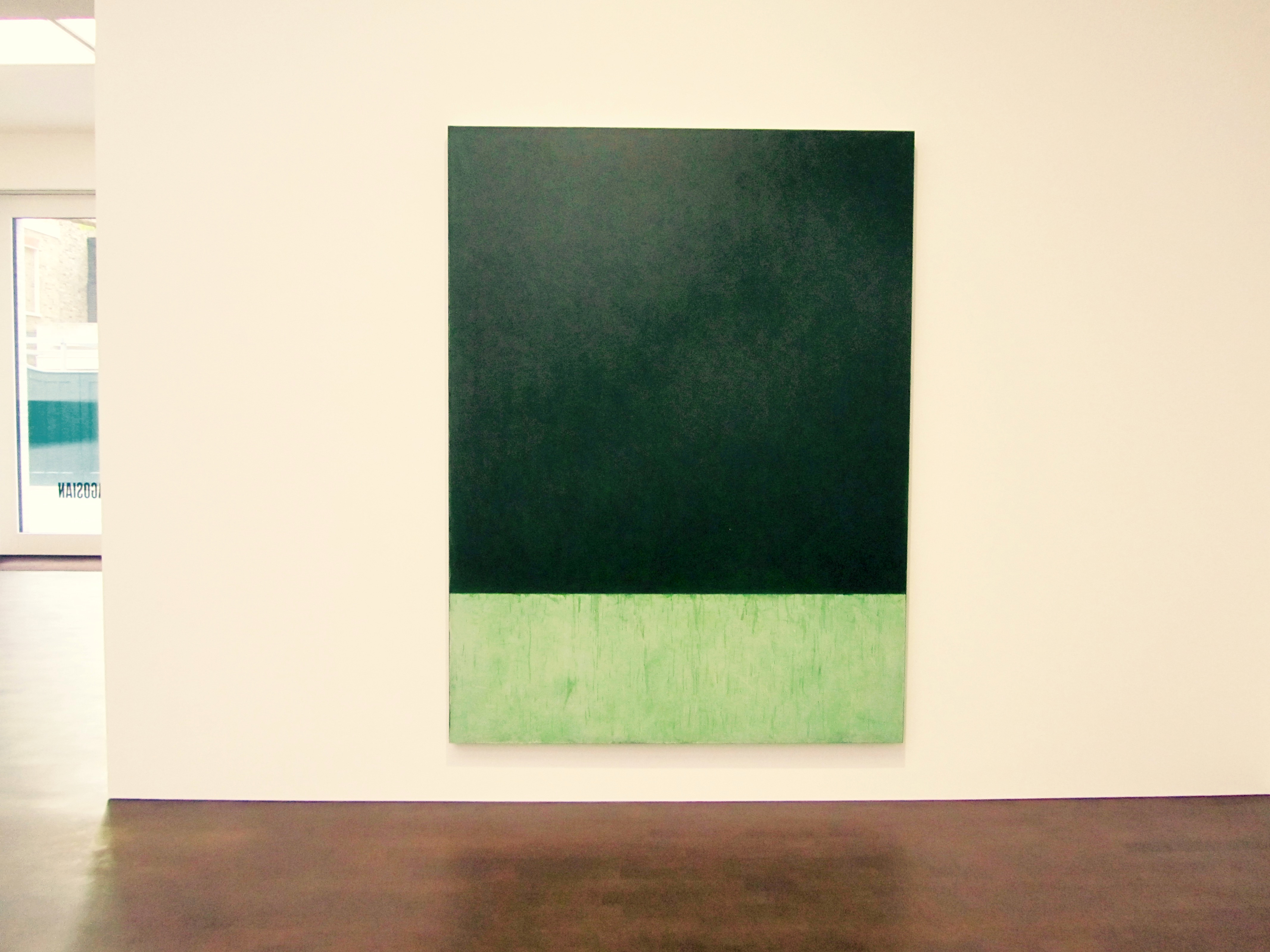
The exhibition proper consisted of ten new paintings and the gallery was a greenhouse where we bathed in their light, we soaked it up and absorbed their energy. The paintings were consolidated blocks of essential oils, concentrations of chlorophyll reduced to a green thought in a green shade.
But a distilled essence is impossible to photograph. I may as well try taking pictures of a perfume.

Williamsburg
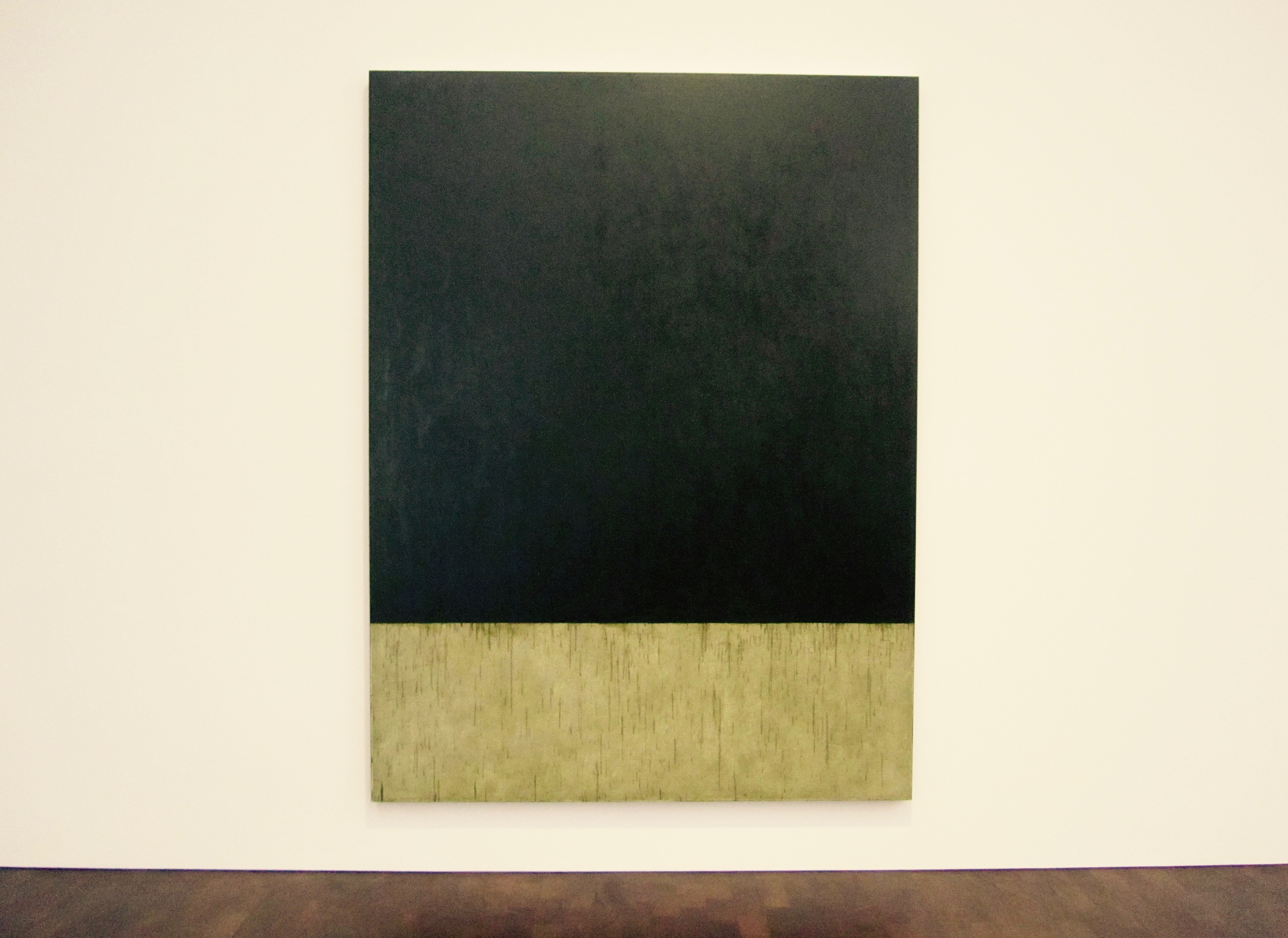
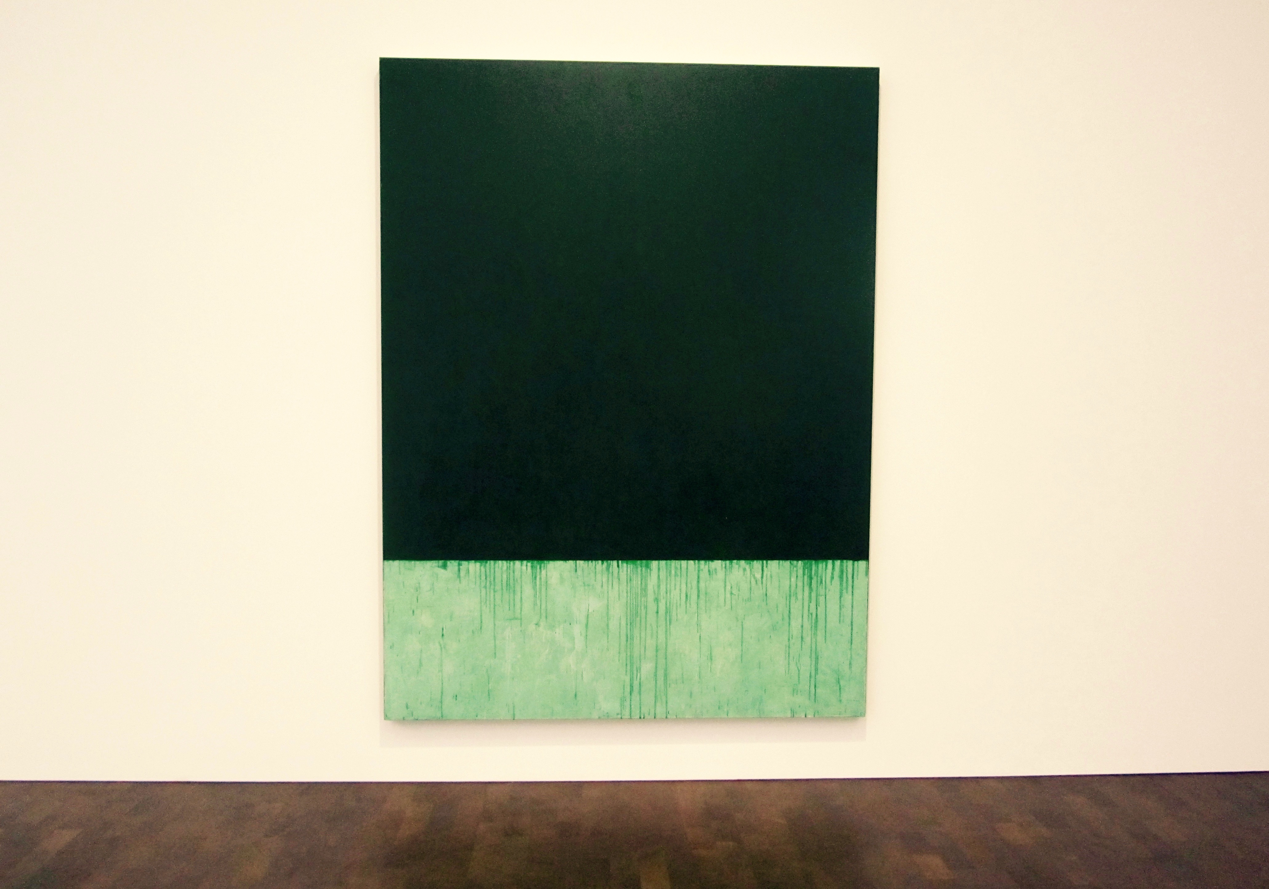
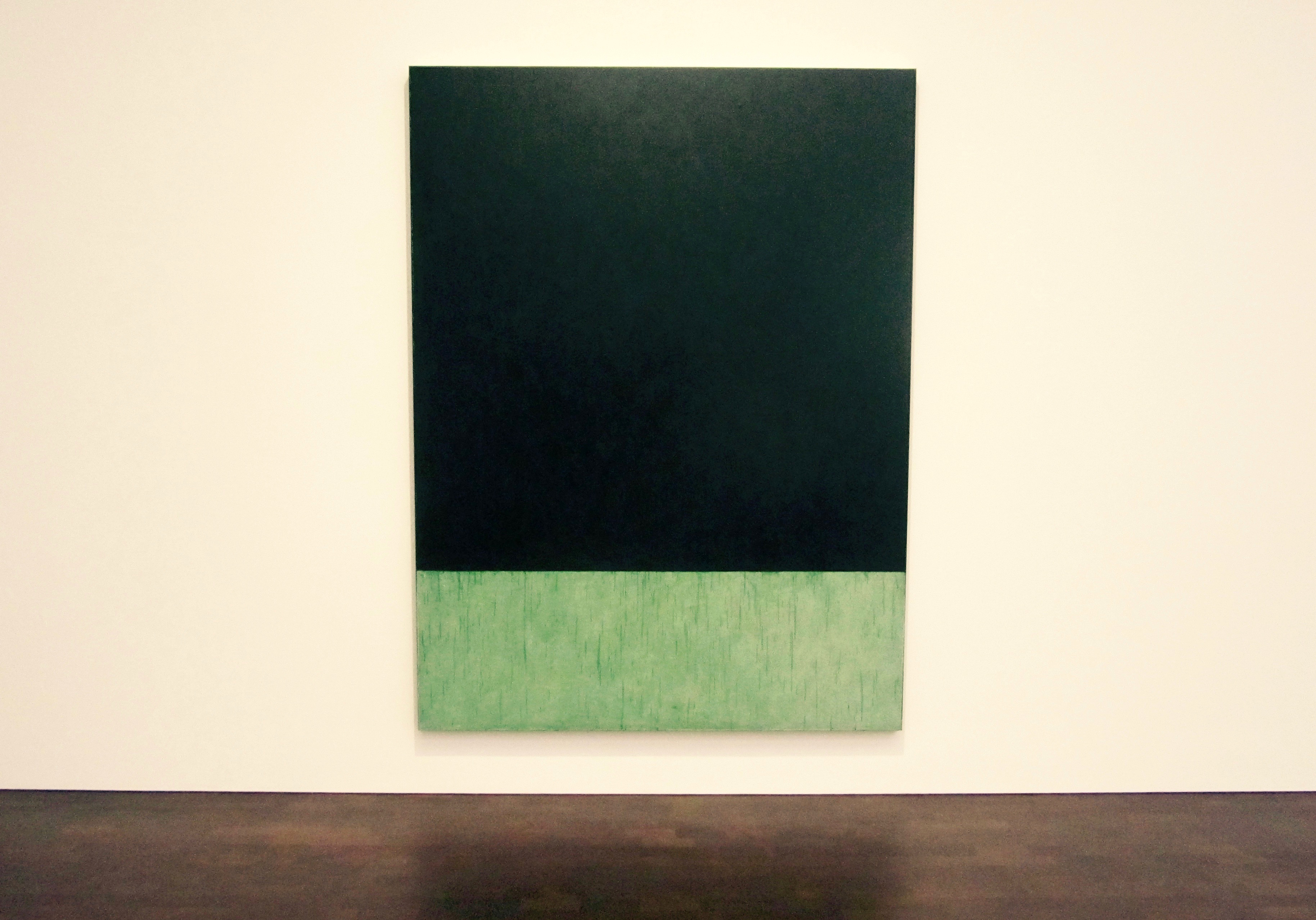
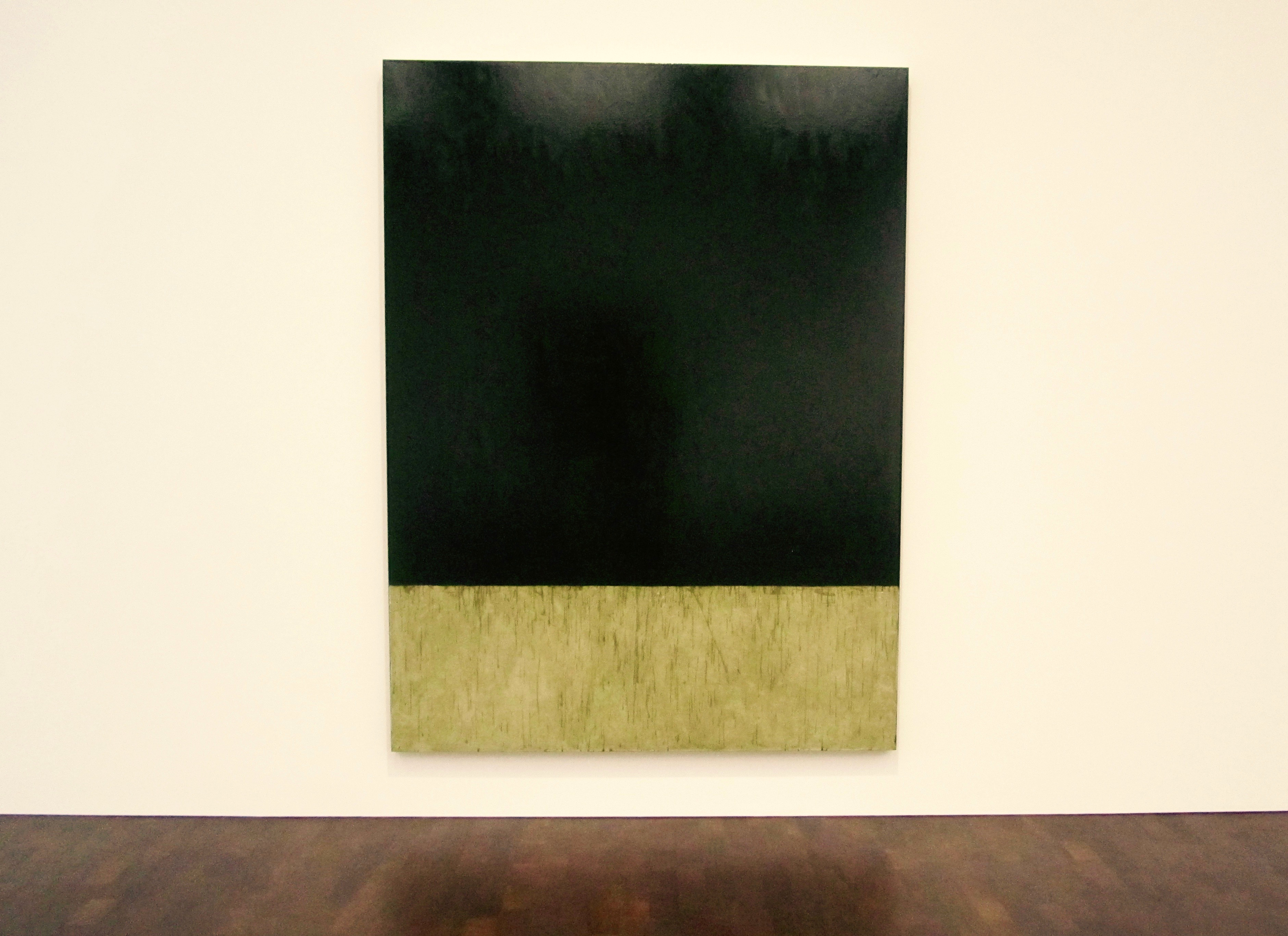
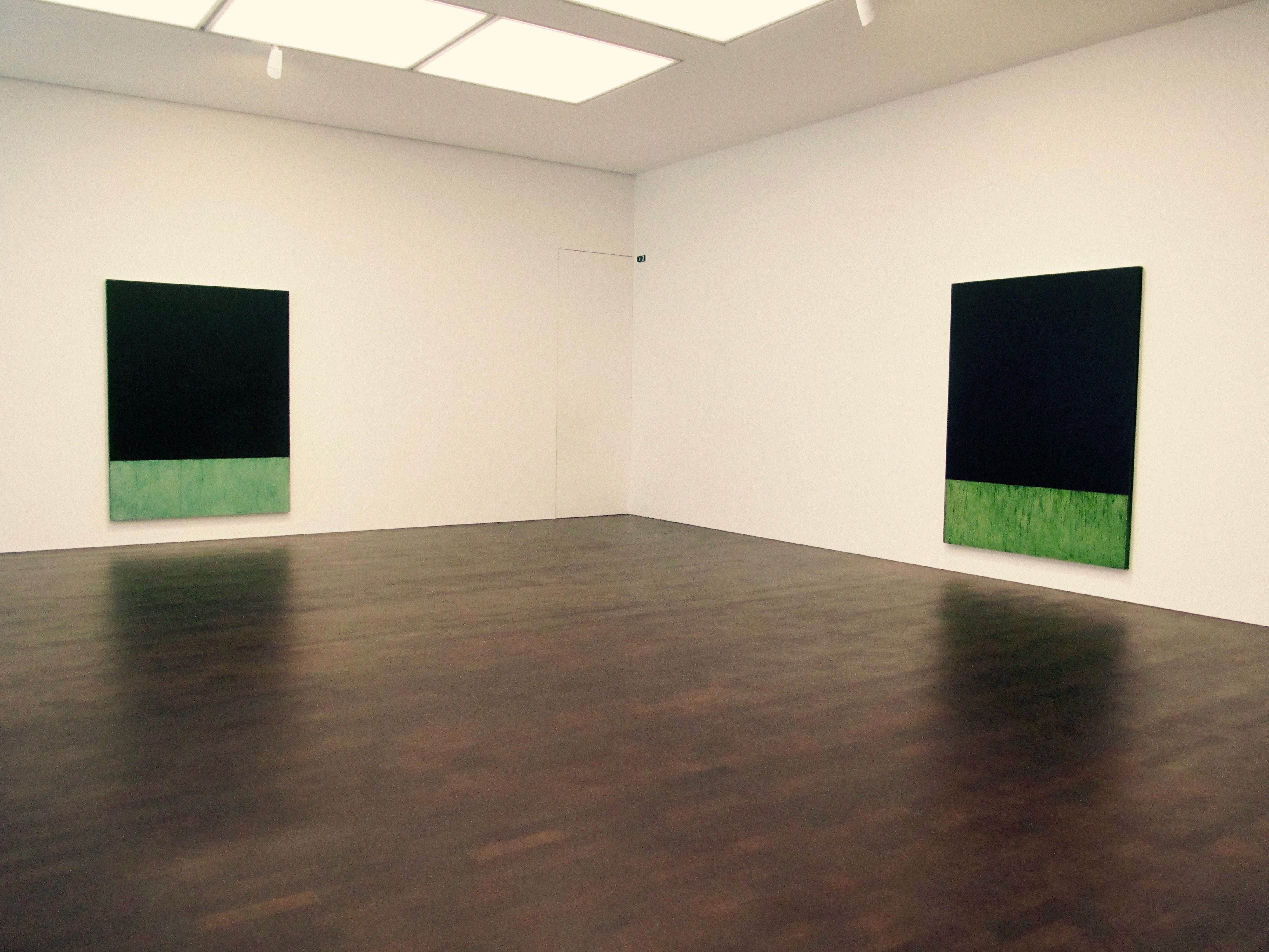
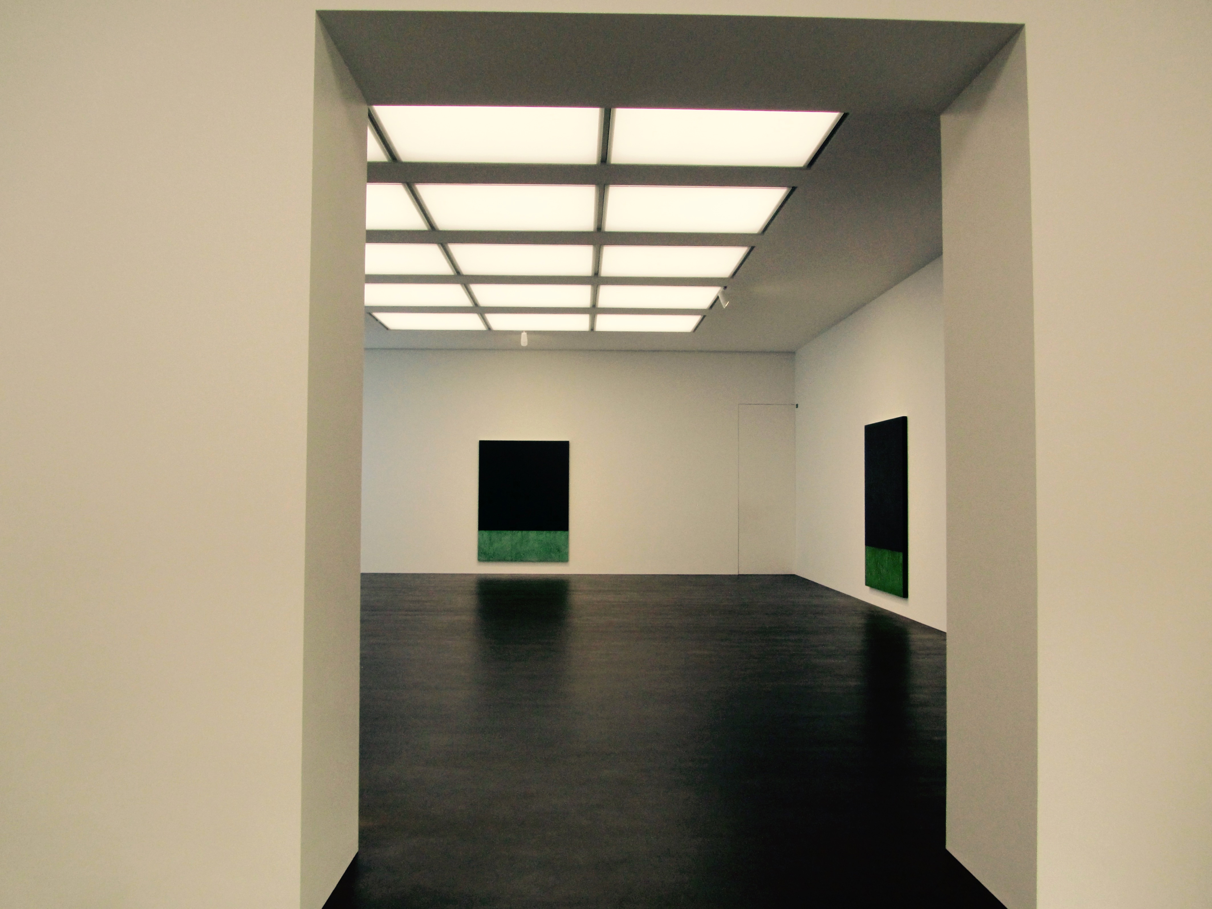
Since resuming his engagement with ‘terre verte’ Marden has begun layering oil paint of this single colour, focusing his conditions in order to heighten them, so to speak. Thus ‘terre verte’ is both medium and subject for Marden as he explores its chromatic nuances while reflecting on the material exigencies of painting itself. For a series of ten new, identically sized paintings measuring eight by six feet, he has employed ten different brands of ‘terre verte’ oil paint – from his favoured Williamsburg to Holbein and Sennelier, among others – each a variation on the indefinable hue. The slow-drying paint is thinned and applied gradually to the canvas in many successive veils, building a surface of transparent yet intense colour. The contingent residue of these layers forms a visible record of the painting process at the lower edge of each canvas.
from the exhibition Press Release

Sennelier

Holbein
Blockx
Rublev Antica
Rublev Verona

As a student at Boston, Marden took a course based on Josef Albers’s celebrated colour theory, and though he surely learnt from it, he chafed at Albers’s purely optical approach to the subject. Looking at the old masters in the Museum of Fine Arts, Marden realized that colours not only provoke optical effects through their interaction but also embody meaning and trigger associations. The painter’s instinctive feeling for the material origins of pigments in minerals and plants, and their primordial associations, would lead in time to the set of paintings titled ‘Elements’, which draw upon the system of medieval alchemy in which the symbolic colours of the four elements – red for fire, blue for water, green for earth, and yellow for air – also correspond to mind, spirit, body, and soul. From antiquity to the Renaissance and beyond, the four elements were often aligned with the four humours, and in this way the body itself might be implicit in the matter of painting.
Terre Verte: Paul Hills
Holbein (Verona)
Vasari Ancienne
For many years now Marden has reserved a margin at the foot of his paintings, below the colour field, where drips and splashes remain visible, like loose threads hanging from the edge of a woven textile. These trickles of paint act as telltale signs of the coming into being of the work, and at the same time hint at what has been obscured and negated. In the present series of canvases in terre verte he has widened the margin and covered it with a single translucent coat of green: by chance, the relative proportions of the dark field and the paler margin below are comparable to those of a Renaissance altarpiece with a predella beneath. In origin the predella functioned as a step that raised the altarpiece approximately a foot above the altar table. Whereas the main field usually presented iconic images, the predella – closer to the eye level of the priest – furnished a sequence of narrative scenes. Doubtless the affinity with Marden’s colour field with generous margin is fortuitous, yet the parallel is suggestive. After all, the artist once claimed that ‘painters are among the priests – worker priests of the cult of man – searching to understand but never to know’. In place of the narrative with figures, this is the narrative of painting itself, the process in which terre verte runs liquid over the chalk-pale predella. Like roots that clutch, green returns to the earth.
Terre Verte: Paul Hills

Winsor + Newton
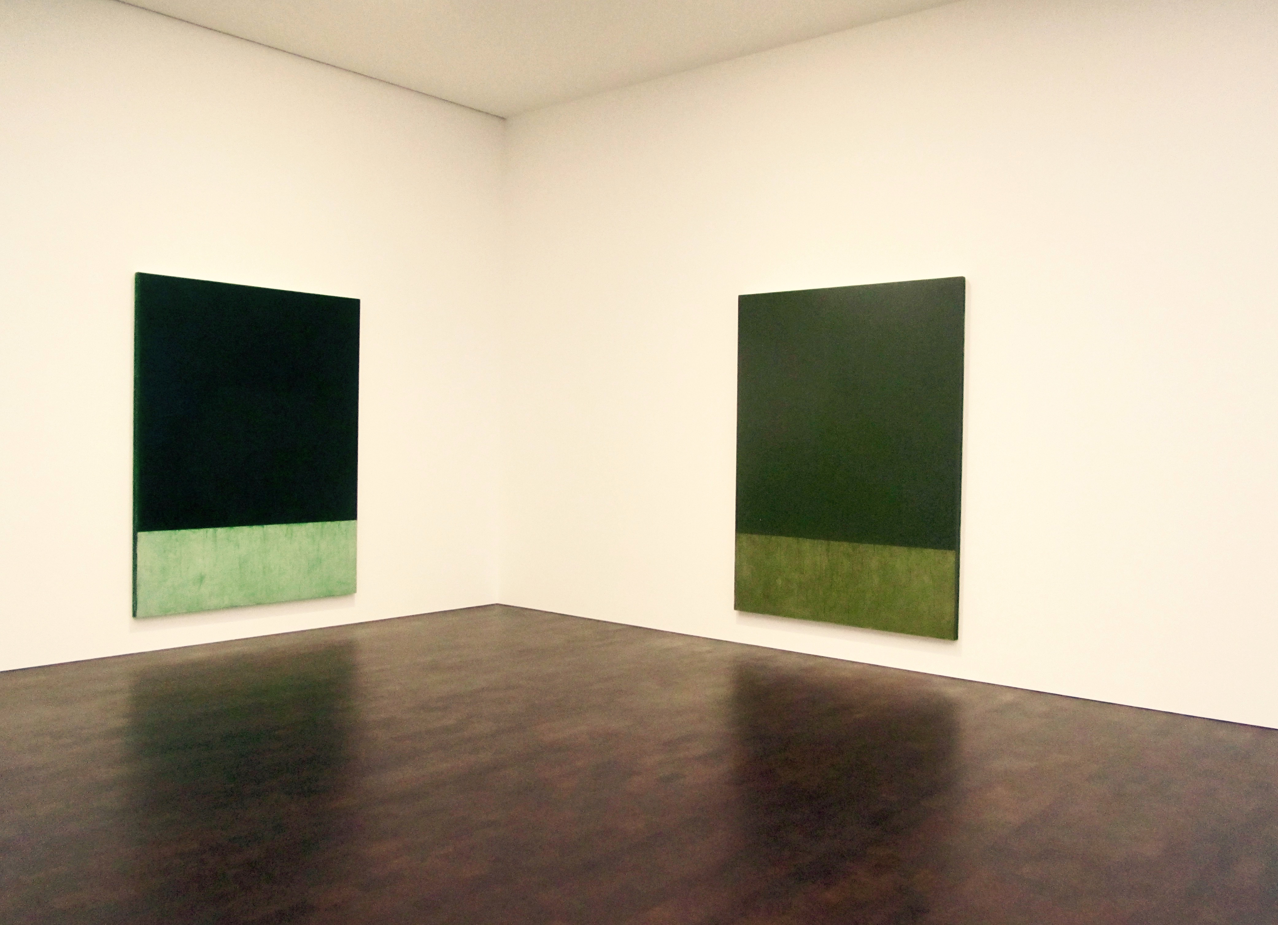
Trees – the play of their branches and colour of their foliage, leaf upon leaf – have long been Marden’s muses and sometimes his accomplices. Twigs and branches fallen from ailanthus trees in New York or collected from other species in Greece have served him as drawing instruments, willowy extensions of the artist’s arm. The blue greys and grey greens of the series ‘Grove Group’ (1972-76) depend upon colour notes Marden jotted down in the olive grove near his studio on the Greek island of Hydra, as well as on his memories of Mediterranean sky and sea. In Pennsylvania in 1993, woodland surrounded the studio where he painted ‘Light in the Forest’. Today the tall windows of his studio at Tivoli, New York, on the Hudson River, look out on the changing foliage of deciduous trees, while photographs show the artist walking on mossy ground or wintry grass against the dark tones of evergreens. Moving in the recent canvases from the silver greens of olive towards the darkness of cypress and yew, Marden distills the deepening of shadow, the elegiac dying of the light. As in the ‘oscura selva’, the ‘dark wood’ where the way is lost, of the opening lines of Dante’s ‘Divine Comedy’, the trace in these paintings is obscured, negated, as layer is applied upon layer. Regularly spaced on the walls of the gallery, these canvases constitute Marden’s green chapel, the secluded cloister of his own creation.
Terre Verte: Paul Hills
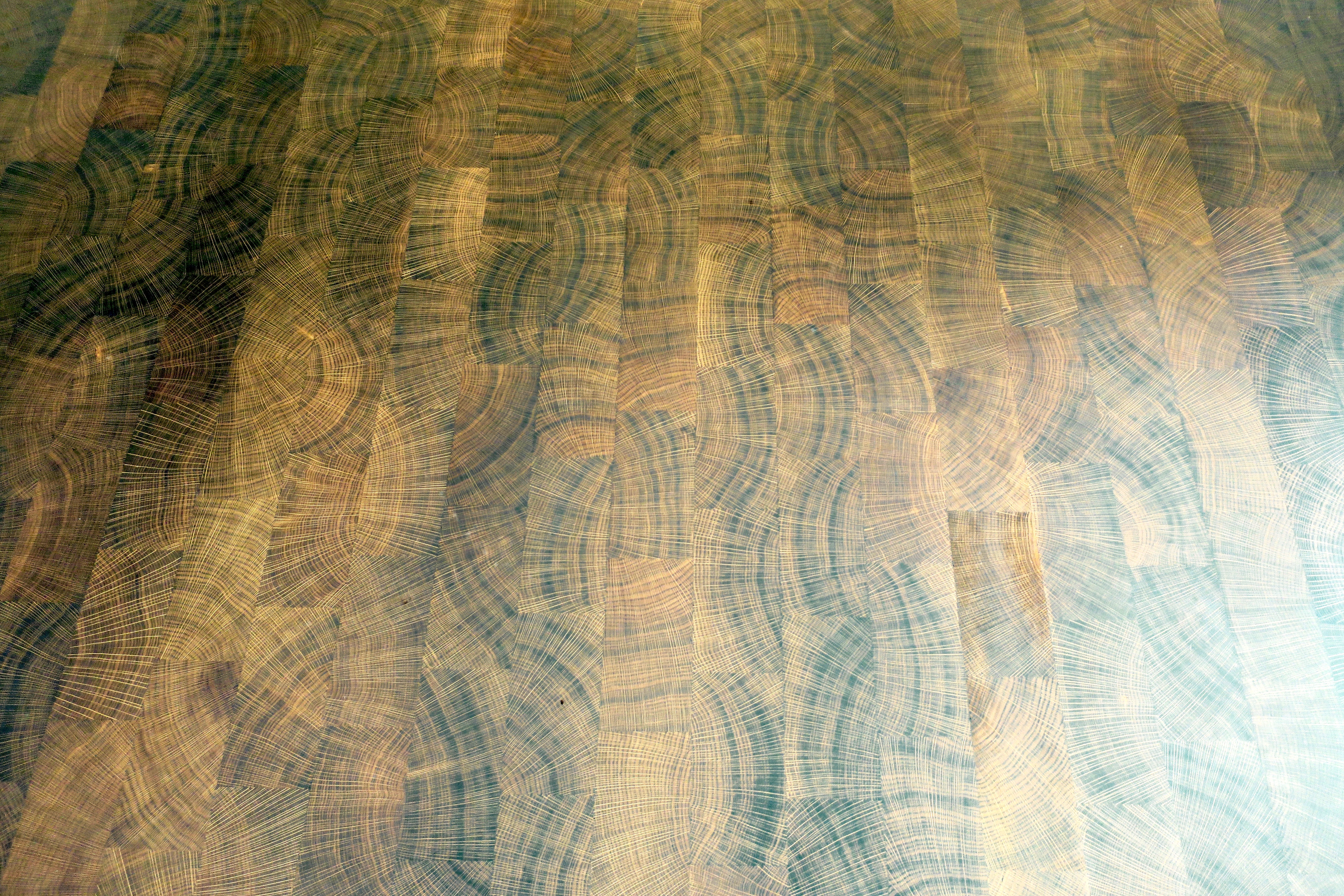
A delicious solitude of evergreens and a beautiful hardwood floor.
It was kind of like a condensed taste of the rarefied flavour of Marden’s own studio.
※
※
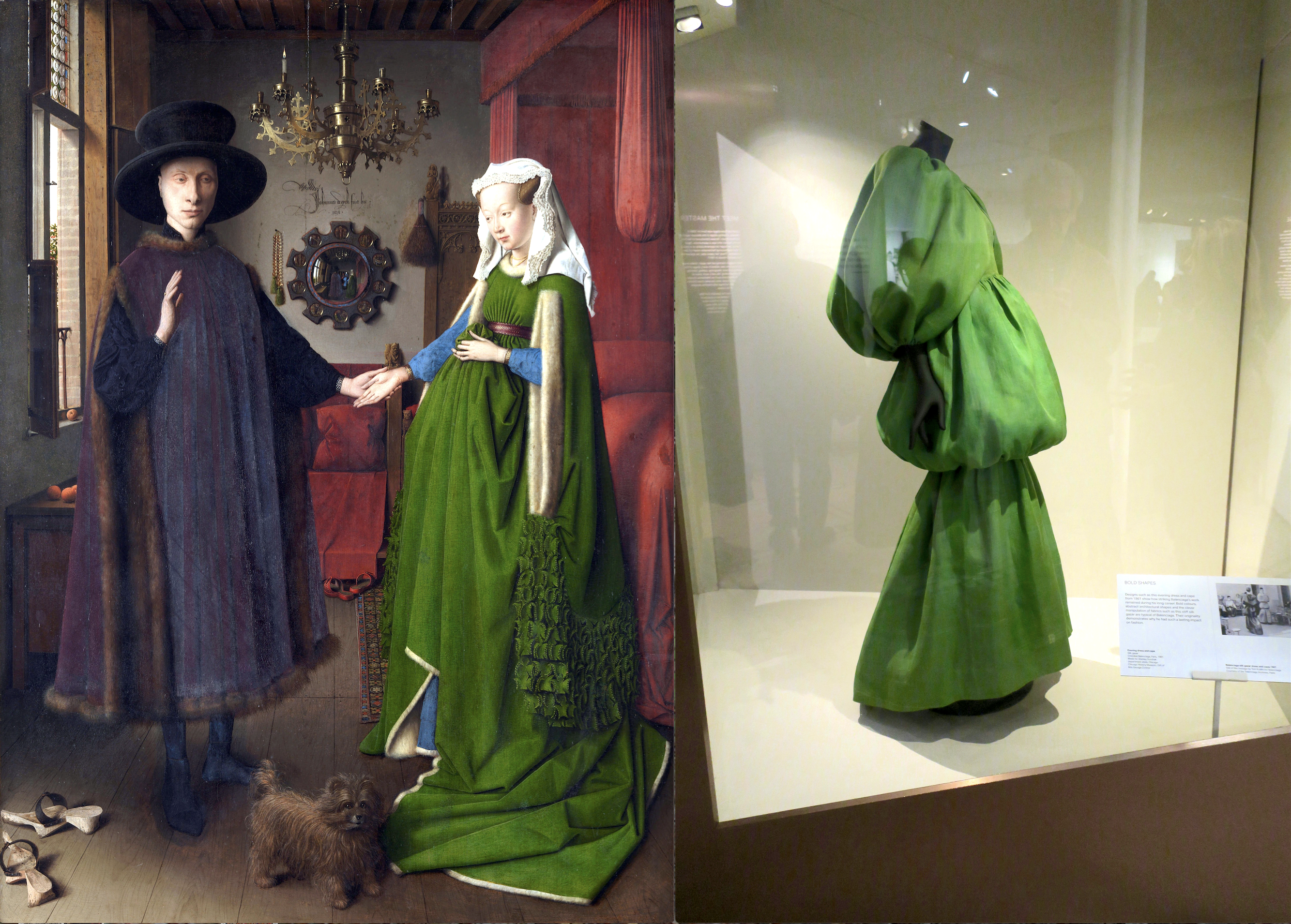
PS: Just as I was preparing the above blogpost I tweeted a photo I’d taken a few days earlier at the Victoria & Albert Museum. It shows a green dress by Cristobal Balenciaga, and I paired it with the Arnolfini Portrait by Jan van Eyck. I titled the tweet – A wealth of cloth. It prompted a fellow tweeter to recommend I read Shamrock Tea by Ciaran Carson and I’ve been engrossed in it ever since. I read this following excerpt just a few minutes ago:
Furthermore, the plant attached to the sod could be identified as Tussilago farfara, the Coltsfoot, from the characteristic hoof shape of its leaves. It is known also as Poor Man’s Tobacco, Dummy-weed, Coughwort, and Wild Rhubarb; its leaves are the basis of the British Herb Tobacco, the other ingredients being Buckbean, Eyebright, Betony, Rosemary, Thyme, Lavender, and Camomile flowers. When he was not smoking (Gallaher’s) ‘Blues’, Celestine would resort to a similar herbal mix, which he jokingly referred to as ‘Shamrock Tea’.
During Lent his home would be suffused with its aroma, almost masking the forensic whiff that emanated from his darkroom, and the sacramental odour of the fixatives he prepared for his tinted photographs, ground from essences of lavender and terebinthine, gum elemi, and virgin wax. He scorned those who simply used the watercolours from a child’s wafer-box. The principles of Cennino Cennini, the last spokesman of the medieval tradition, he argued, were still relevant today: to paint faces, the flesh must first be underpainted with the pale green earth, “terre verte”, and the pink flesh tones hatched thinly on top, working in progressively paler shades from shadow to light; the green was allowed to show through in the half-tones, and nicely imitated the pearly tones of real flesh.
In a brief flirtation with tempera, he had proved Cennino’s assertion that the pale yolk of a town hen’s egg was most suitable for painting the faces of young people with cool fresh colours, while the darker yolk of a country hen’s egg was to be preferred for aged or swarthy persons. To illustrate his point he showed me a retouched print of his only child, my cousin Berenice, whom I had barely noticed until then. She was portrayed as Cleopatra, in a costume apparently contrived from some old silk scarves and a feather boa. Her teeth appeared to have a greenish tinge, and I determined to look more closely at her when I next saw her.
I am almost sure that the photograph I have still of her and me, dated July 1959 on the back, marks that occasion. It was also the feast of Christina the Astonishing, patron saint of psychiatrists.
※
And curiously, or maybe not, since everything is connected, this all happened just as I received an enquiry about our window display of Twig Saints by Chris Kenny from a woman named Krystyna, who was hoping to find a twig for St Christina the Astonishing.
