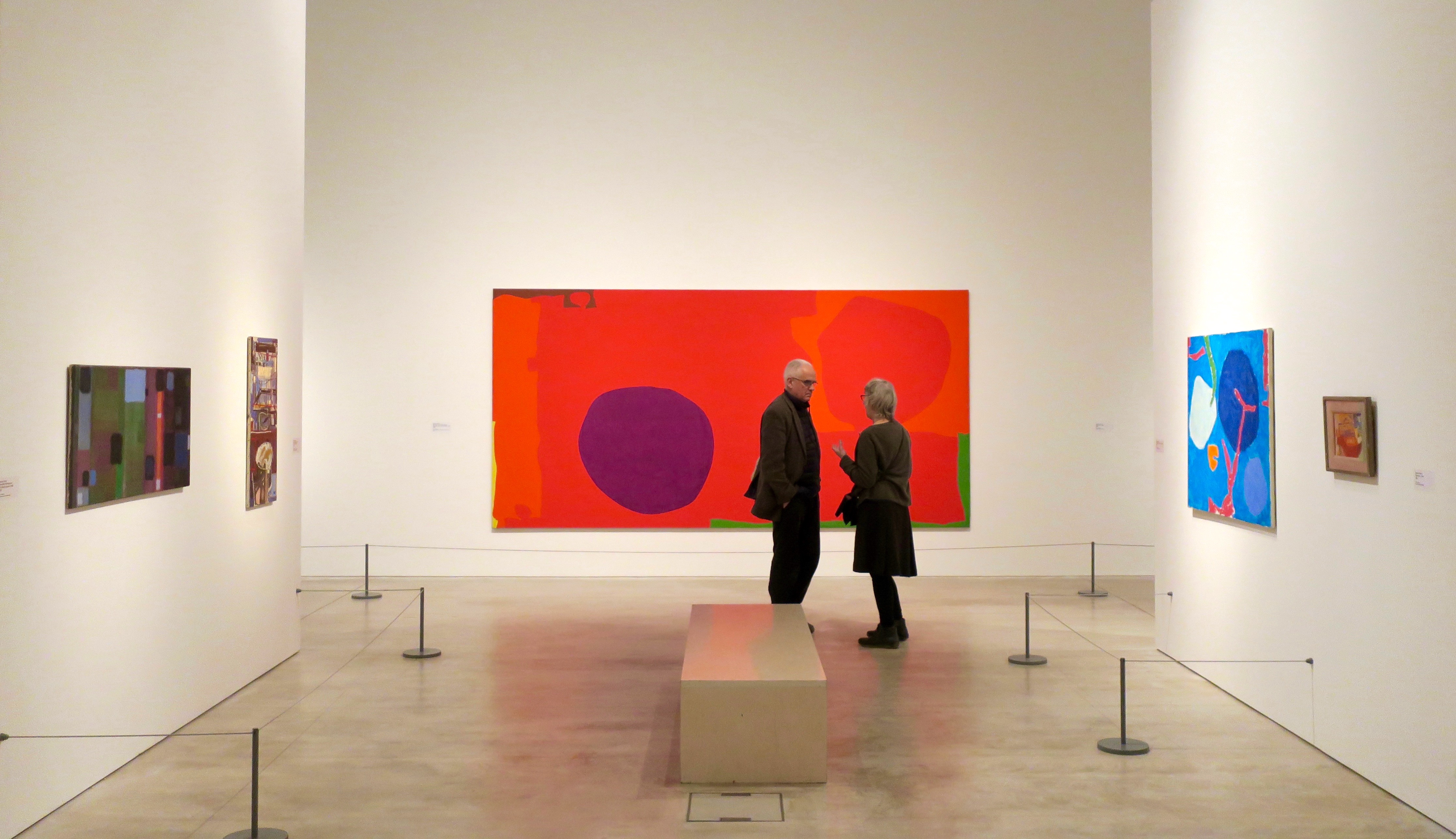
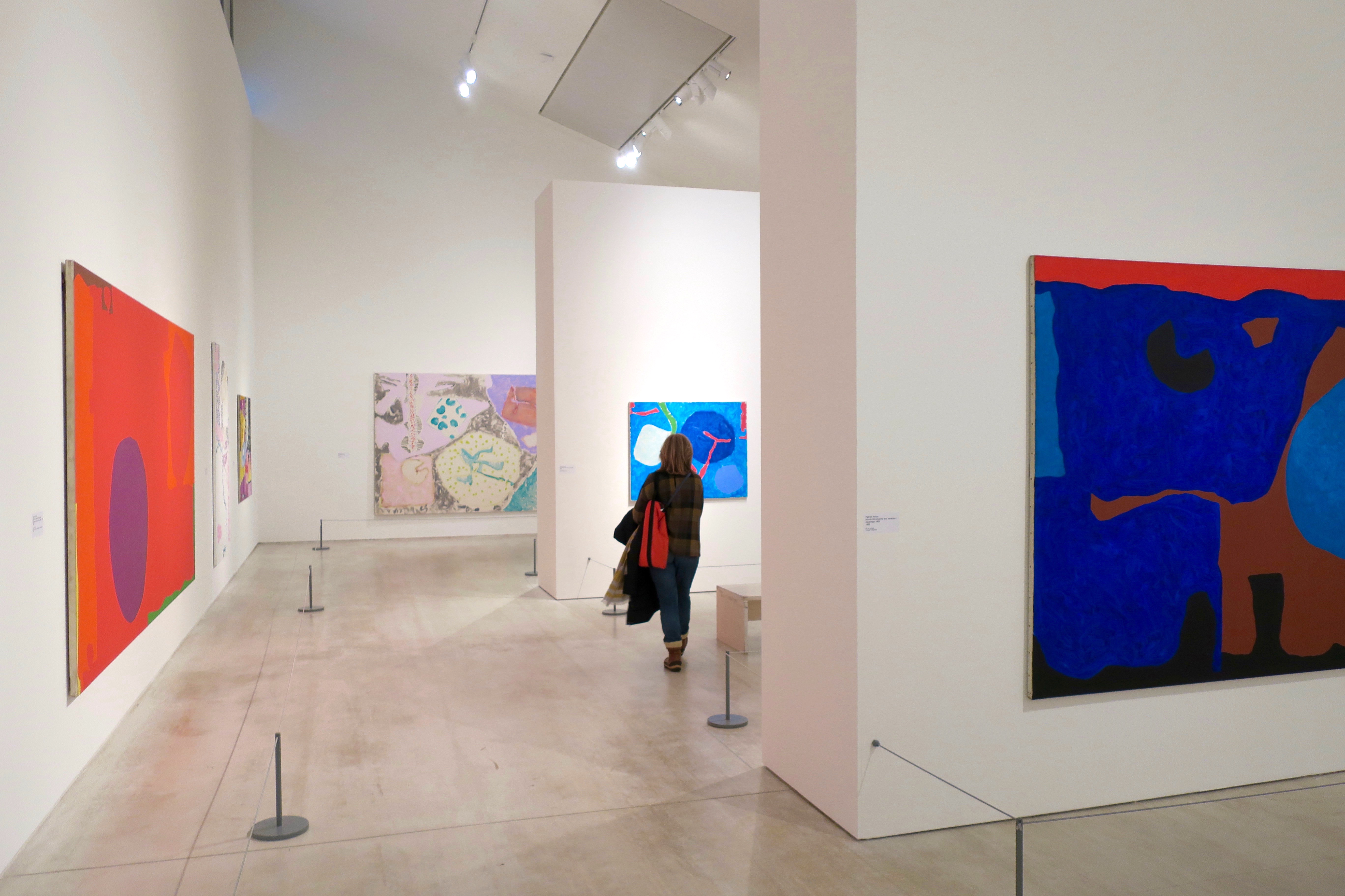
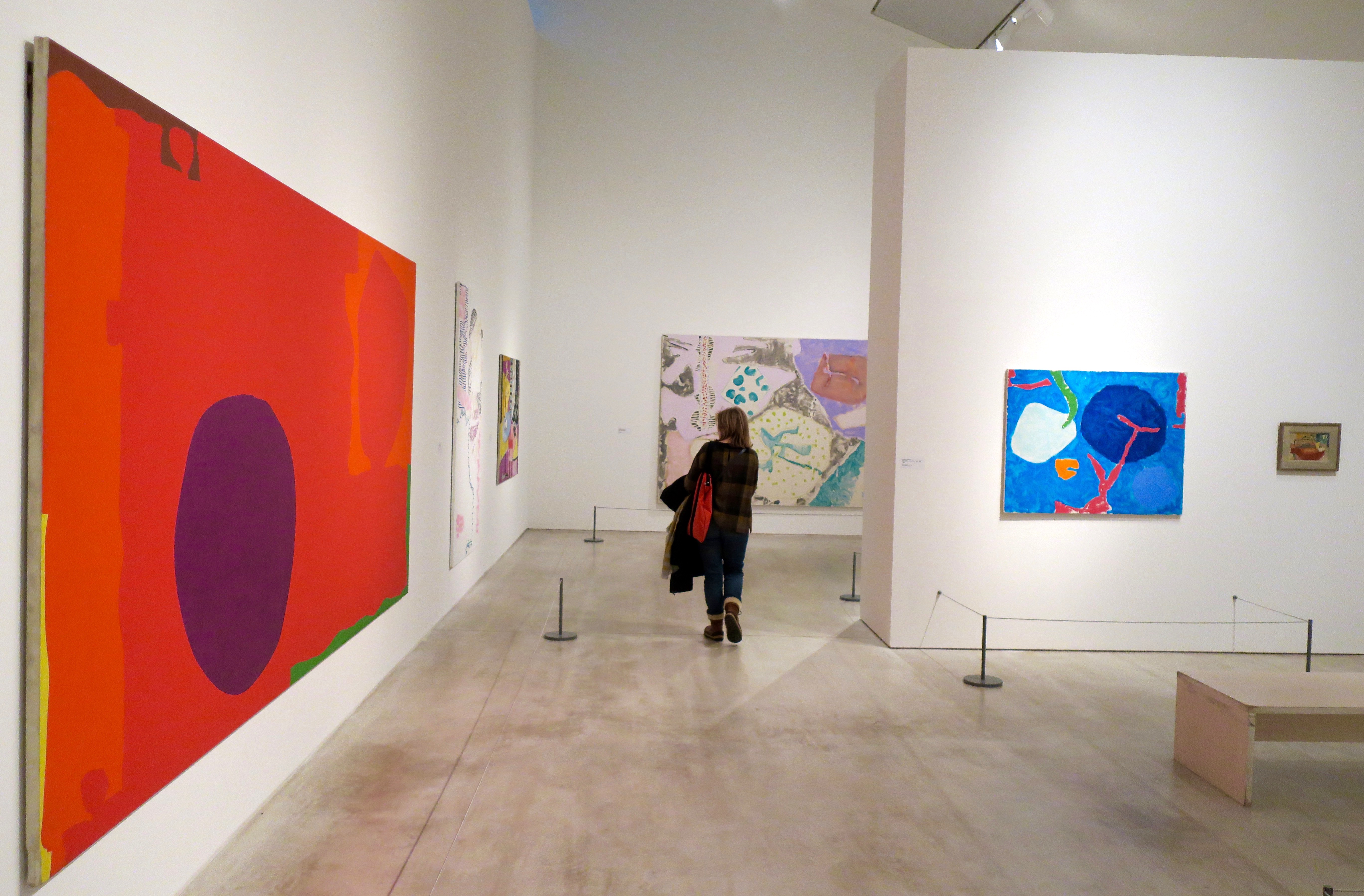
It was the dark limbo daze between Christmas and New Year, when the days melt namelessly into each other and the sun goes on holiday. So we went to the seaside, looking for some winter colour. The Patrick Heron exhibition at Turner Contemporary in Margate was just the ticket.
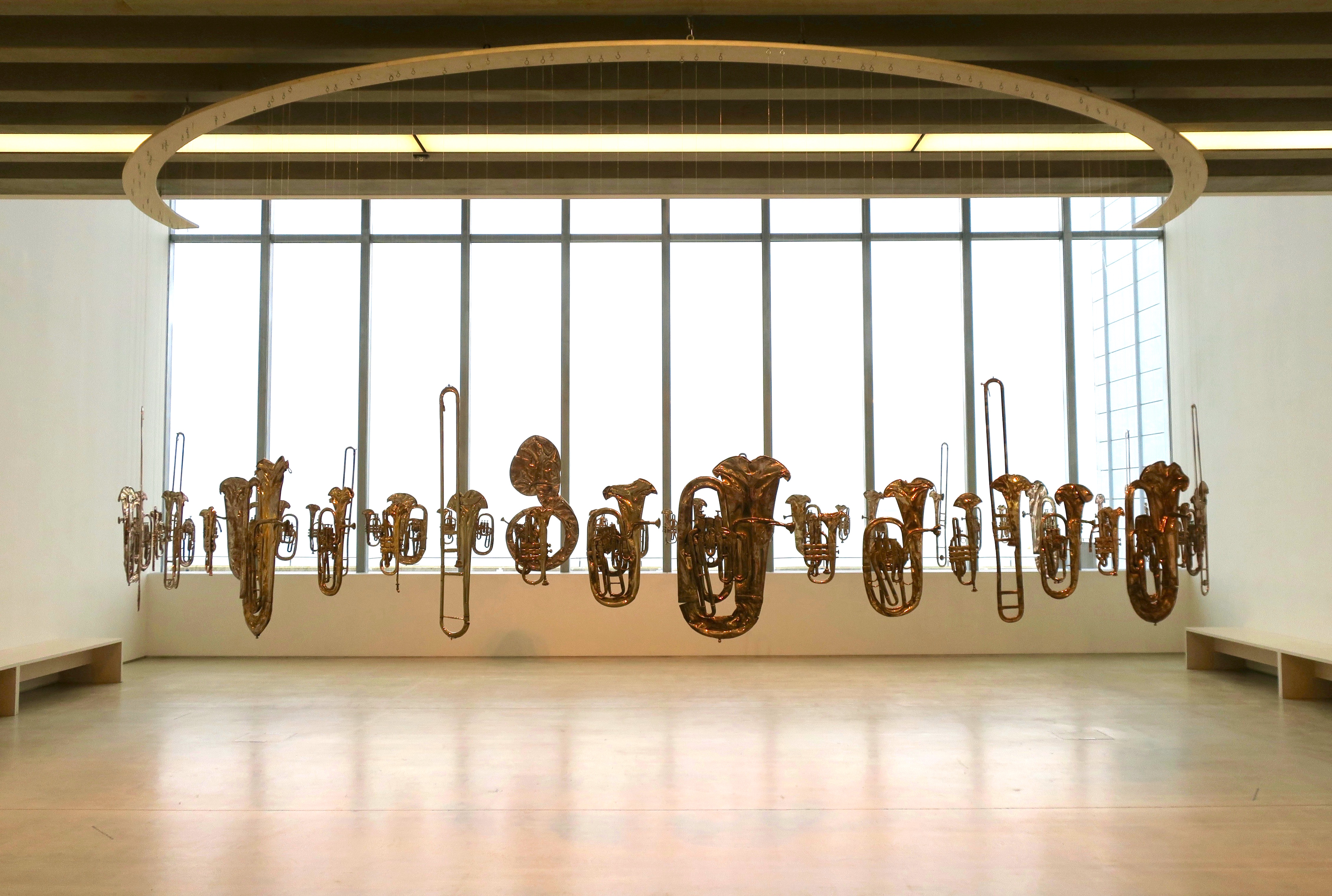
We were welcomed to the gallery with a silent fanfare. Perpetual Canon by Cornelia Parker is a circle of 60 flattened brass band instruments, permanently inhaled and displayed in suspended animation.
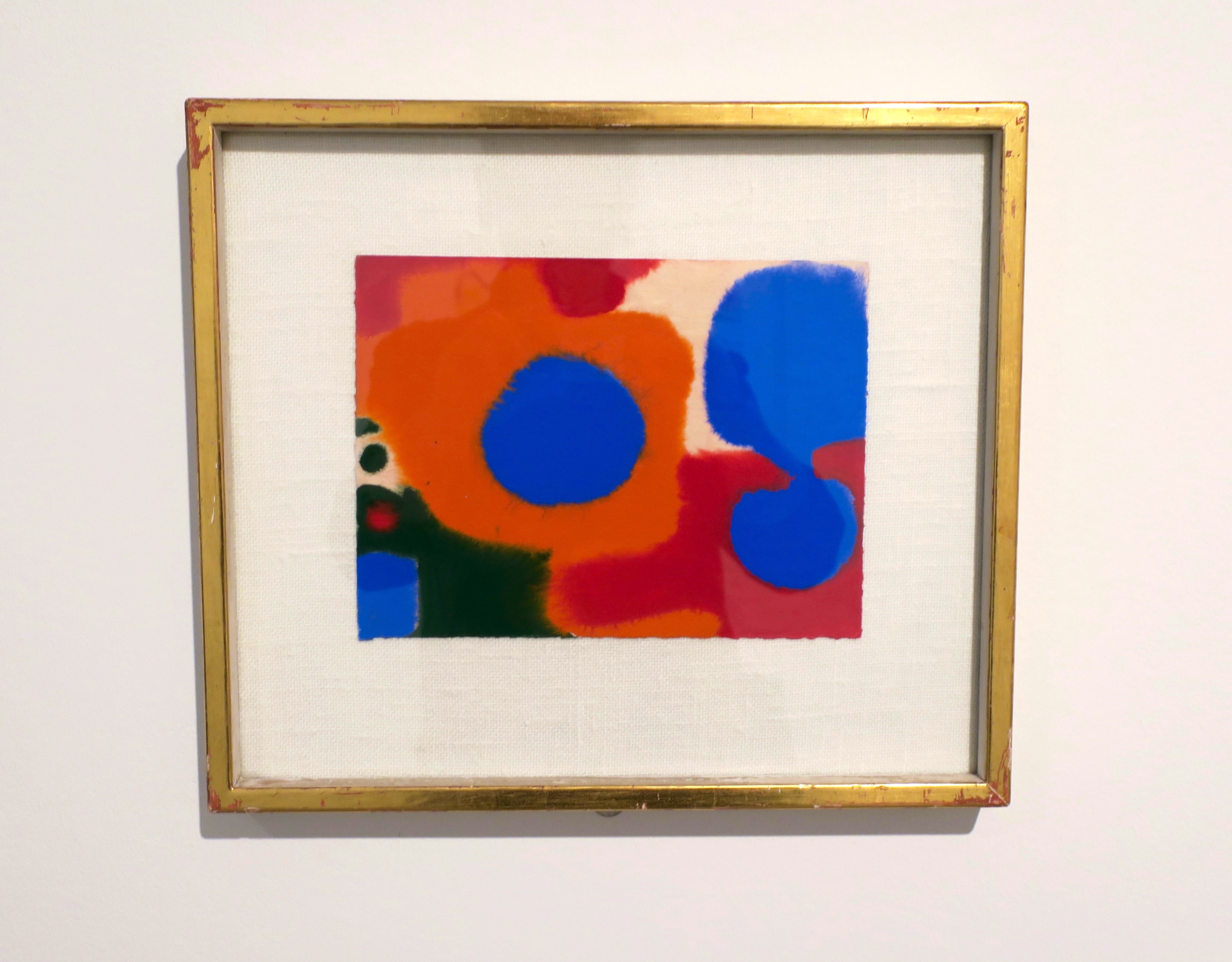
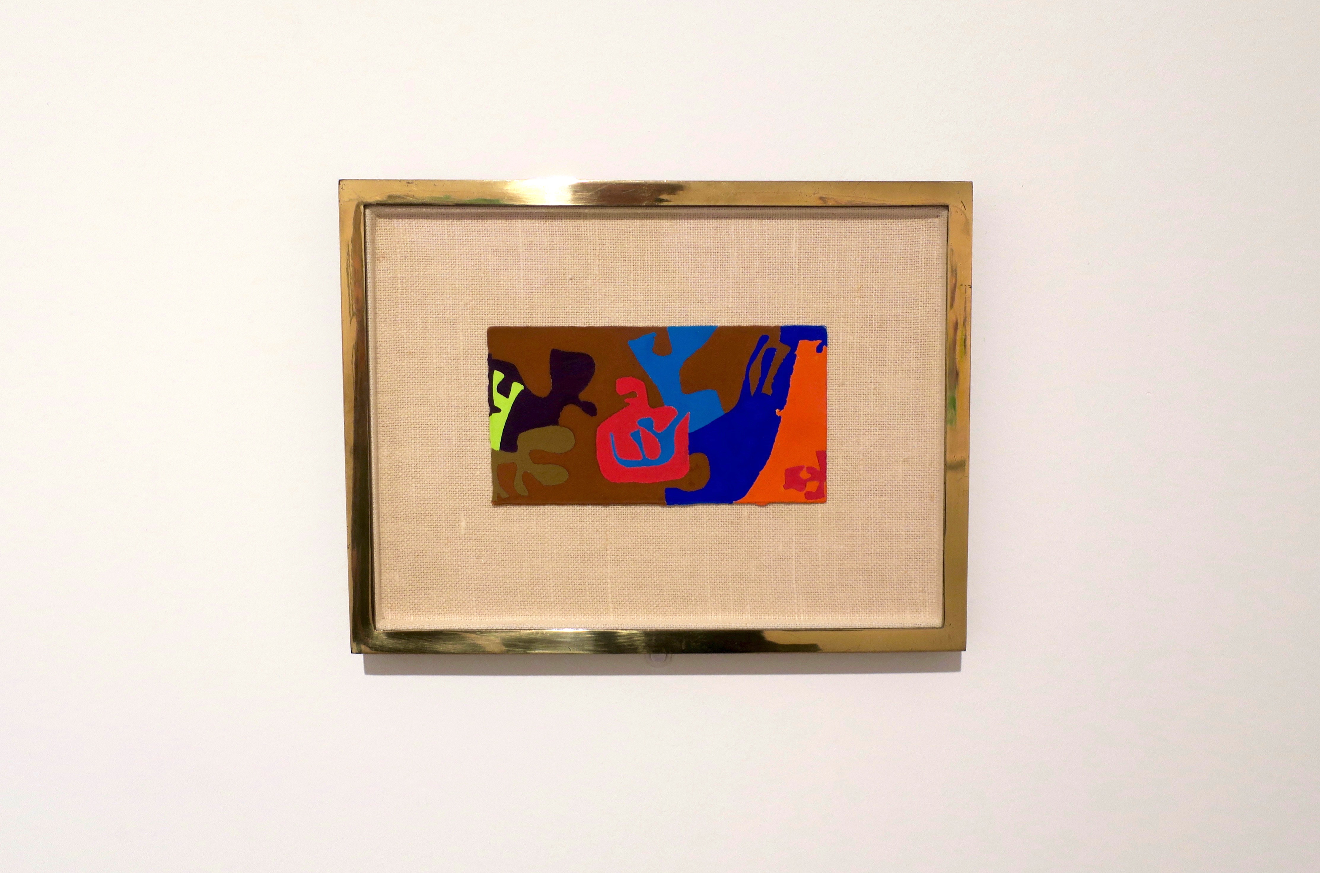
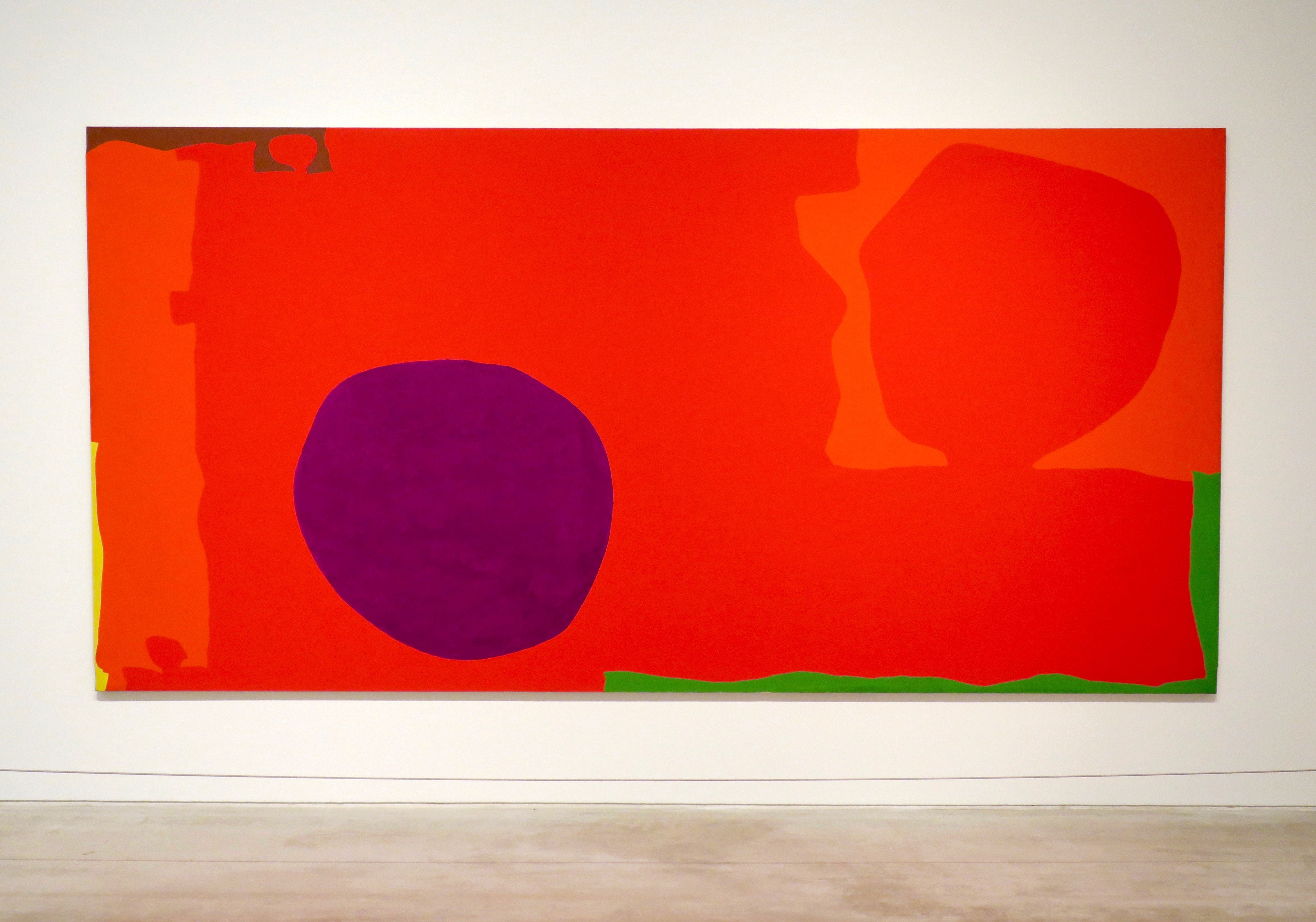
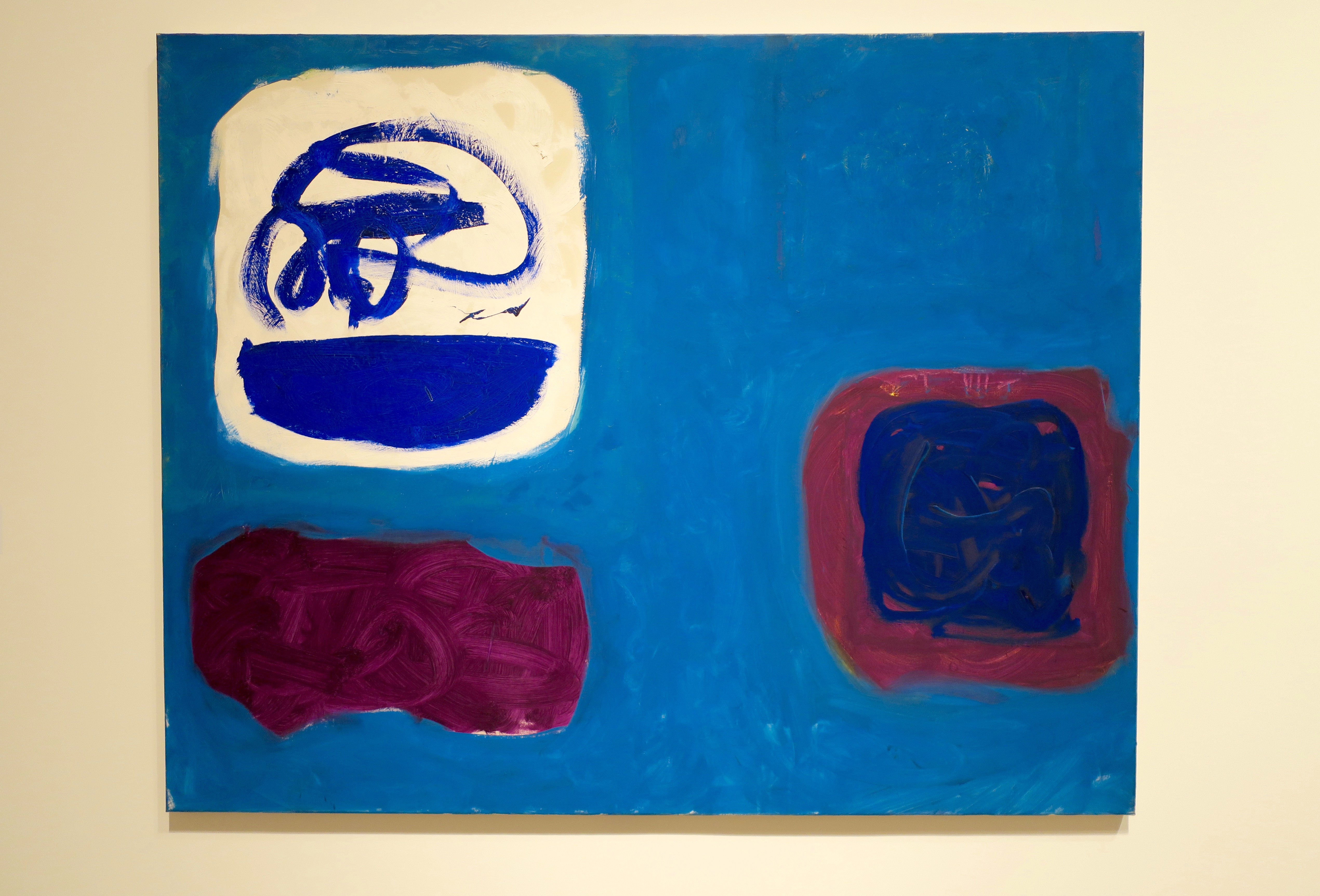
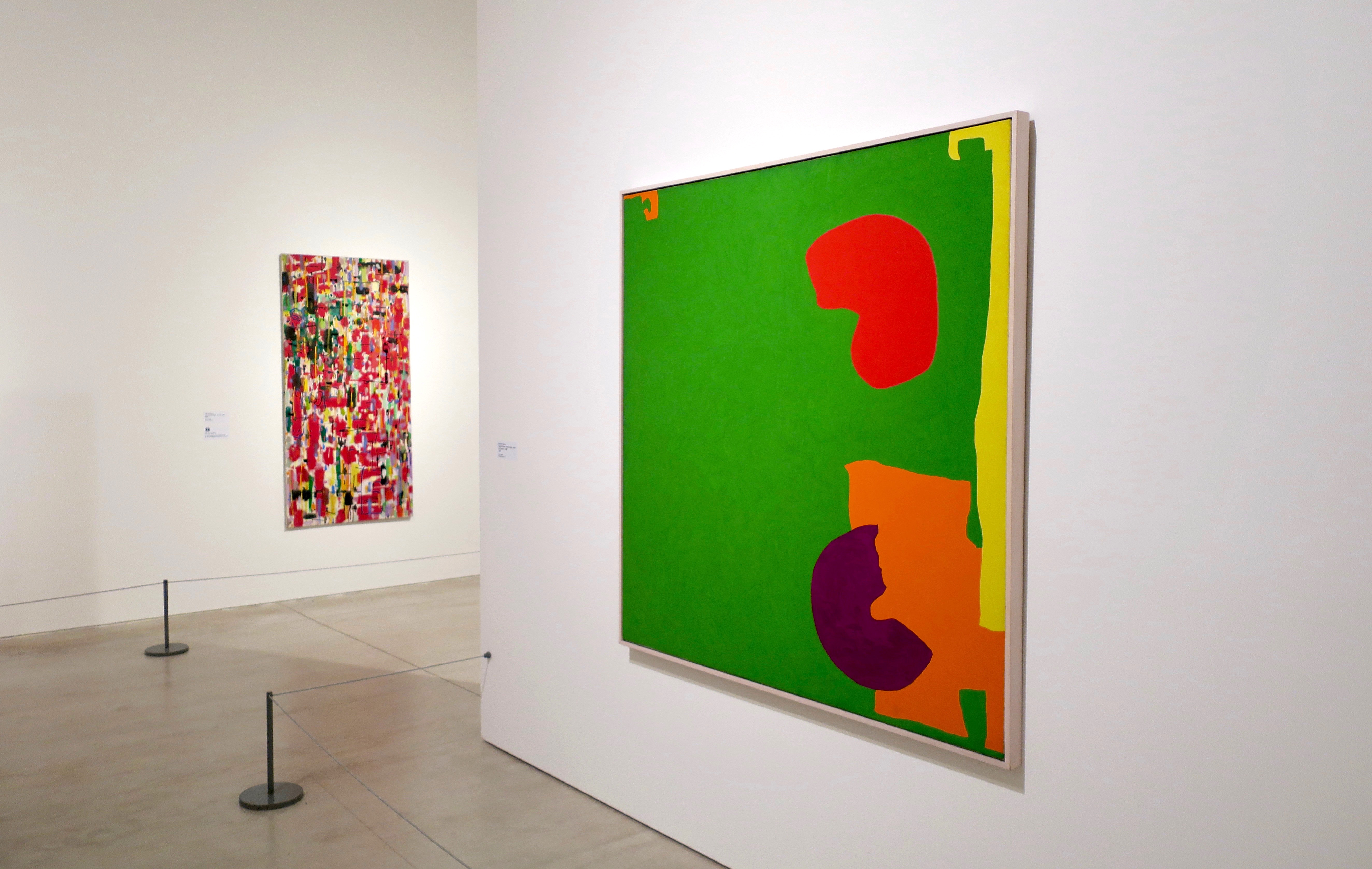
Blue Disc in Irregular Orange with Red, Green and Pink: January 1968
“Whatever one is painting is the record of a moment. I believe painting exists precisely in order to relate our subjective experience, our feelings, to our subjective setting, to the world we are endlessly observing. In painting, merely to observe is to subscribe to the heresy of realism; and merely to project a rhythm is to subscribe to the opposite heresy of non-figuration. Great painting lies between the two and performs the function of both.”
Patrick Heron, 1955
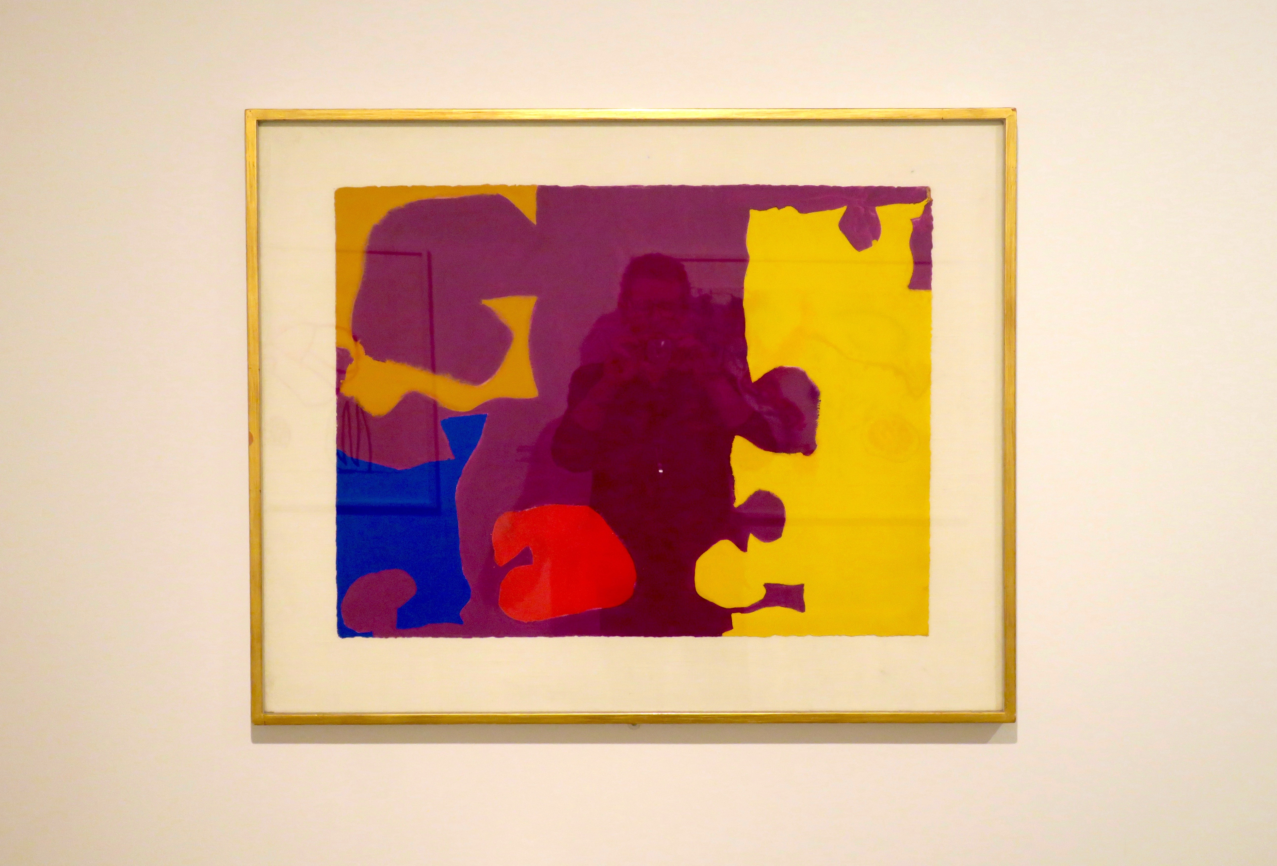
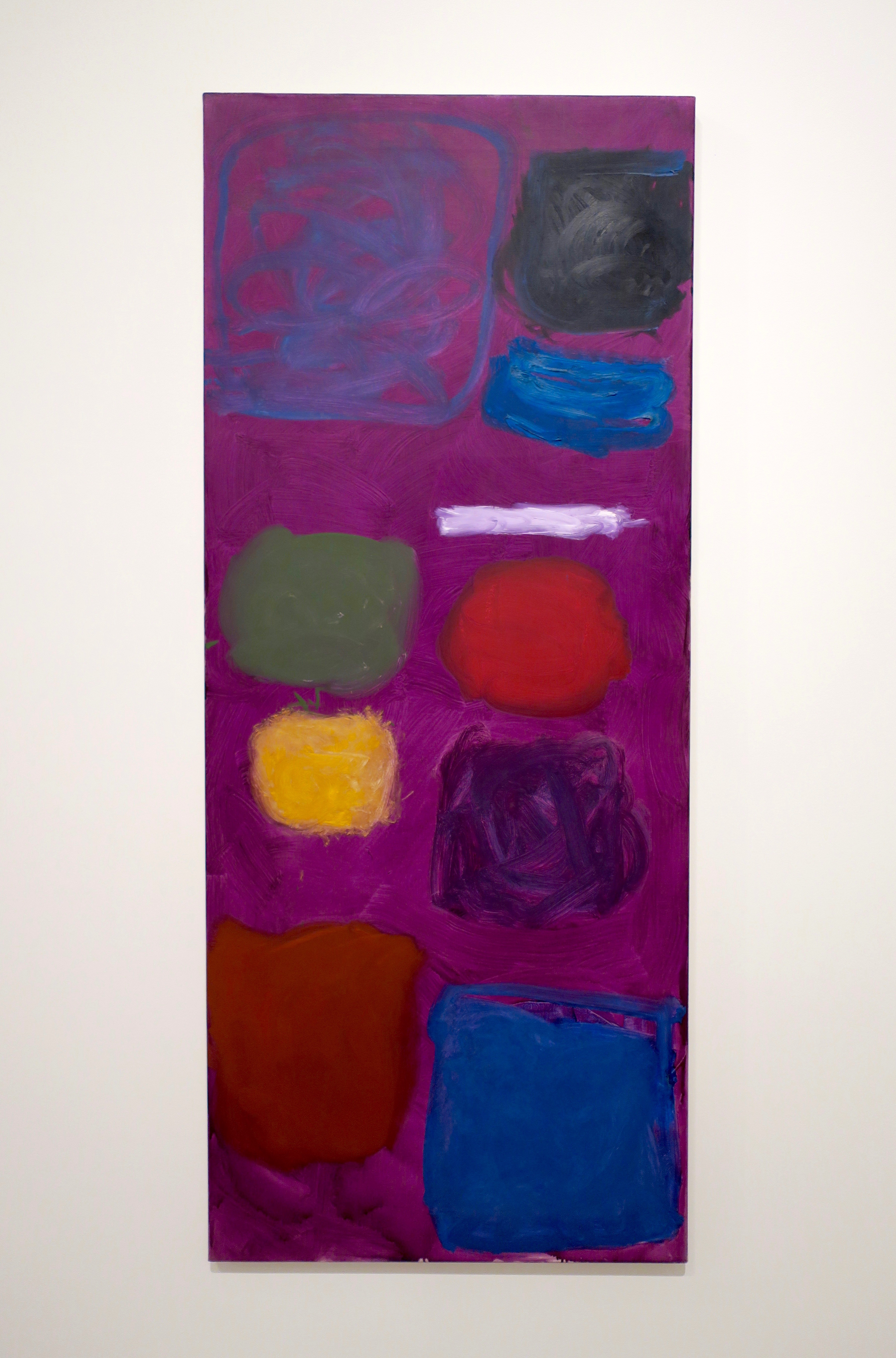
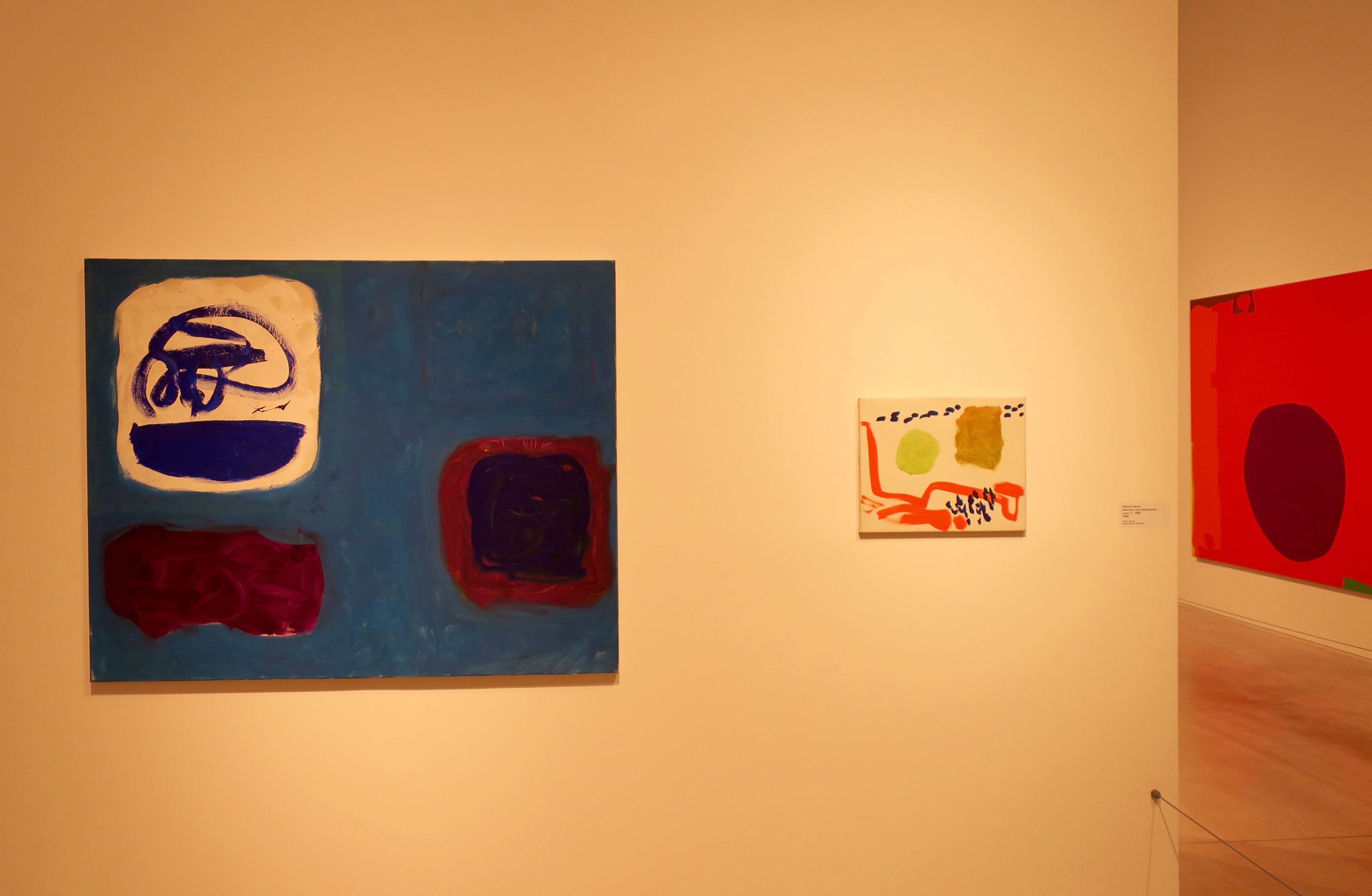
Susanna Christmas: December 1976
“Heron used that most rare and uncanny of gifts: the ability to invent an imagery that was unmistakably his own, and yet which connects immediately with the natural world as we perceive it, and transforms our vision of it. Like those of his acknowledged masters, Braque, Matisse and Bonnard, his paintings are at once evocations and celebrations of the visible, discoveries of what he called ‘the reality of the eye’.”
Marc Lopatin
Gouache: 1970 (Maroon and Yellow)
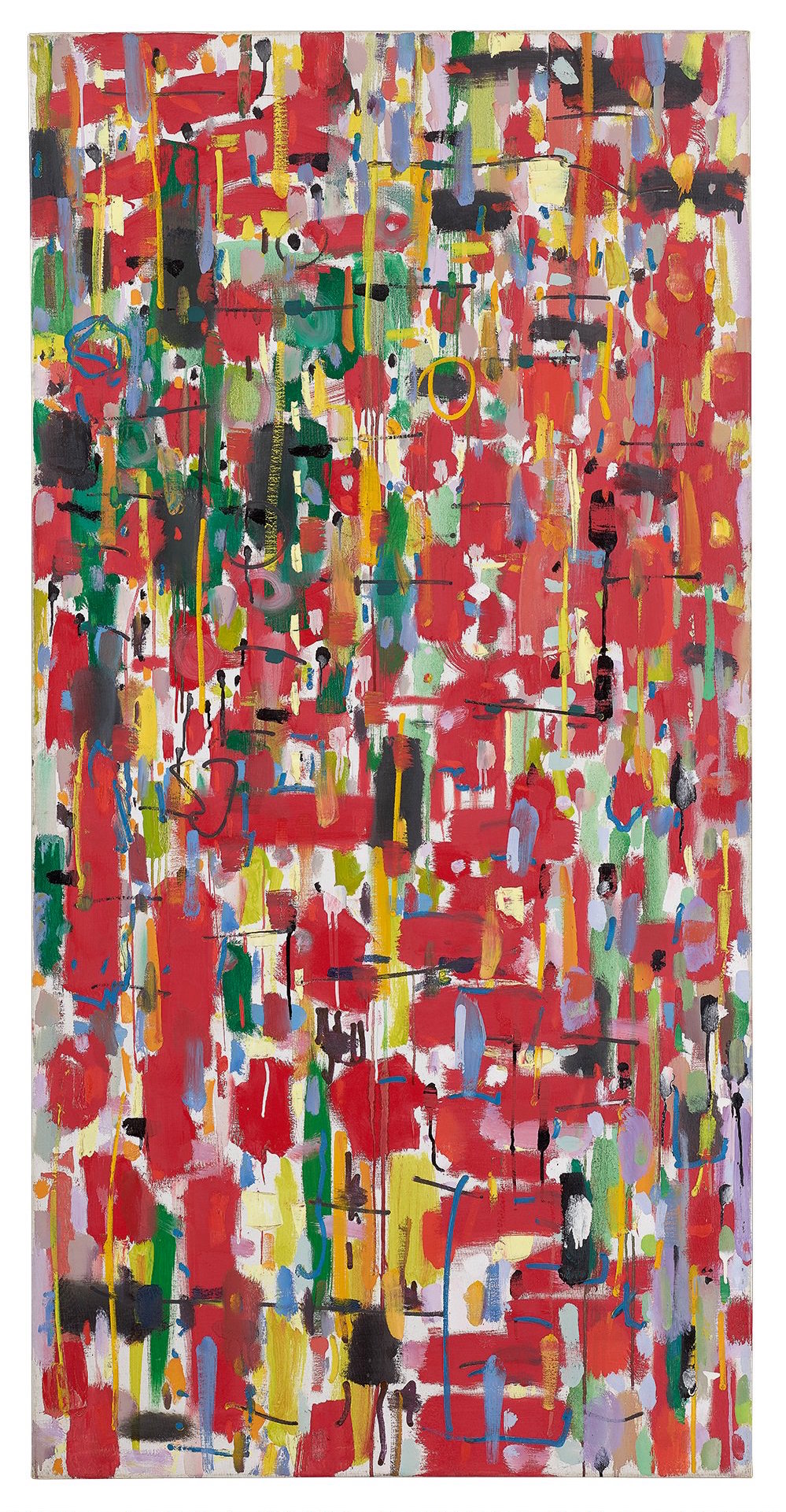
Complex Greens, Reds and Orange: July 1976 – January 1977
Christmas Eve: 1951
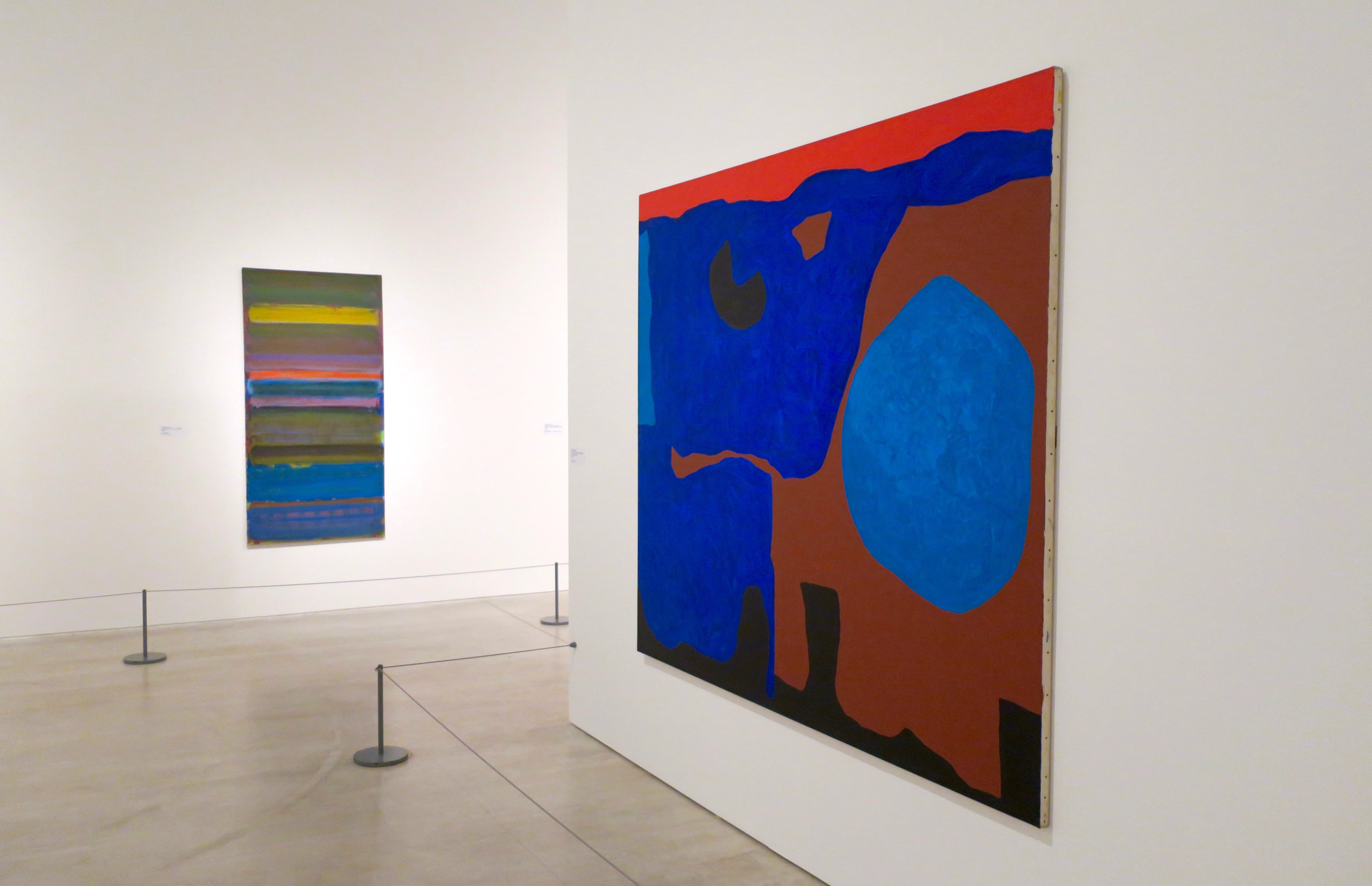
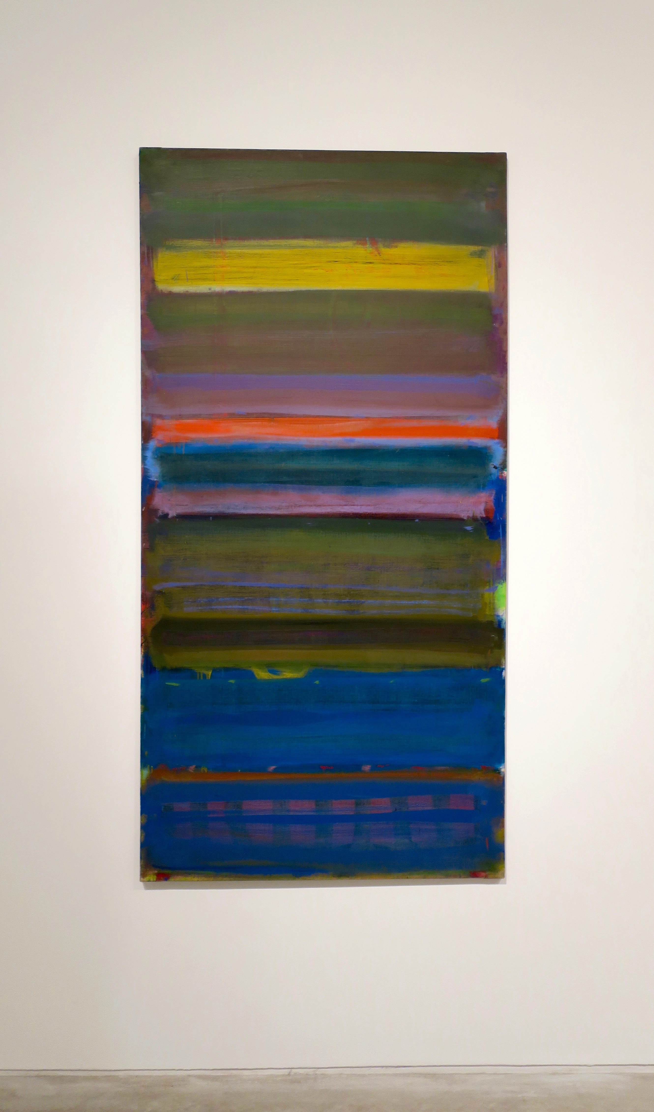
Tall Purple: September 1962
Lux Eterna: May – June 1958
Cadmium with Violet, Scarlet, Emerald, Lemon and Venetian: 1969
“Throughout his life Heron emphasised the importance of a painting’s edges by clustering high levels of activity in these areas. He did this because he felt that it is at the edges of a painting where our visual understanding switches out of the painting and back to the three dimensions of the real world. For Heron the edges of a painting were ‘the springboard for all compositional reality’.”
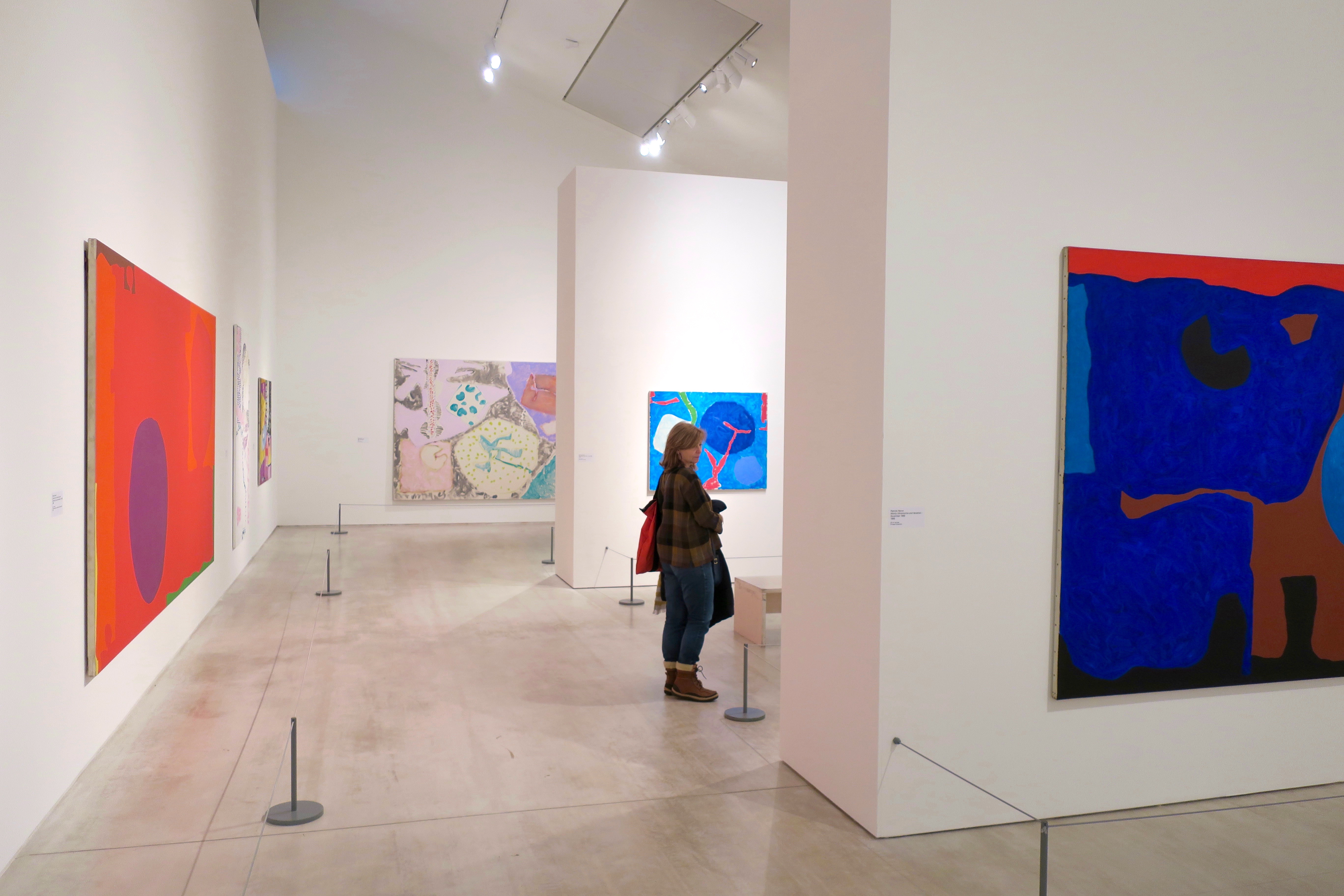
Ceruleum Sea: June 1961
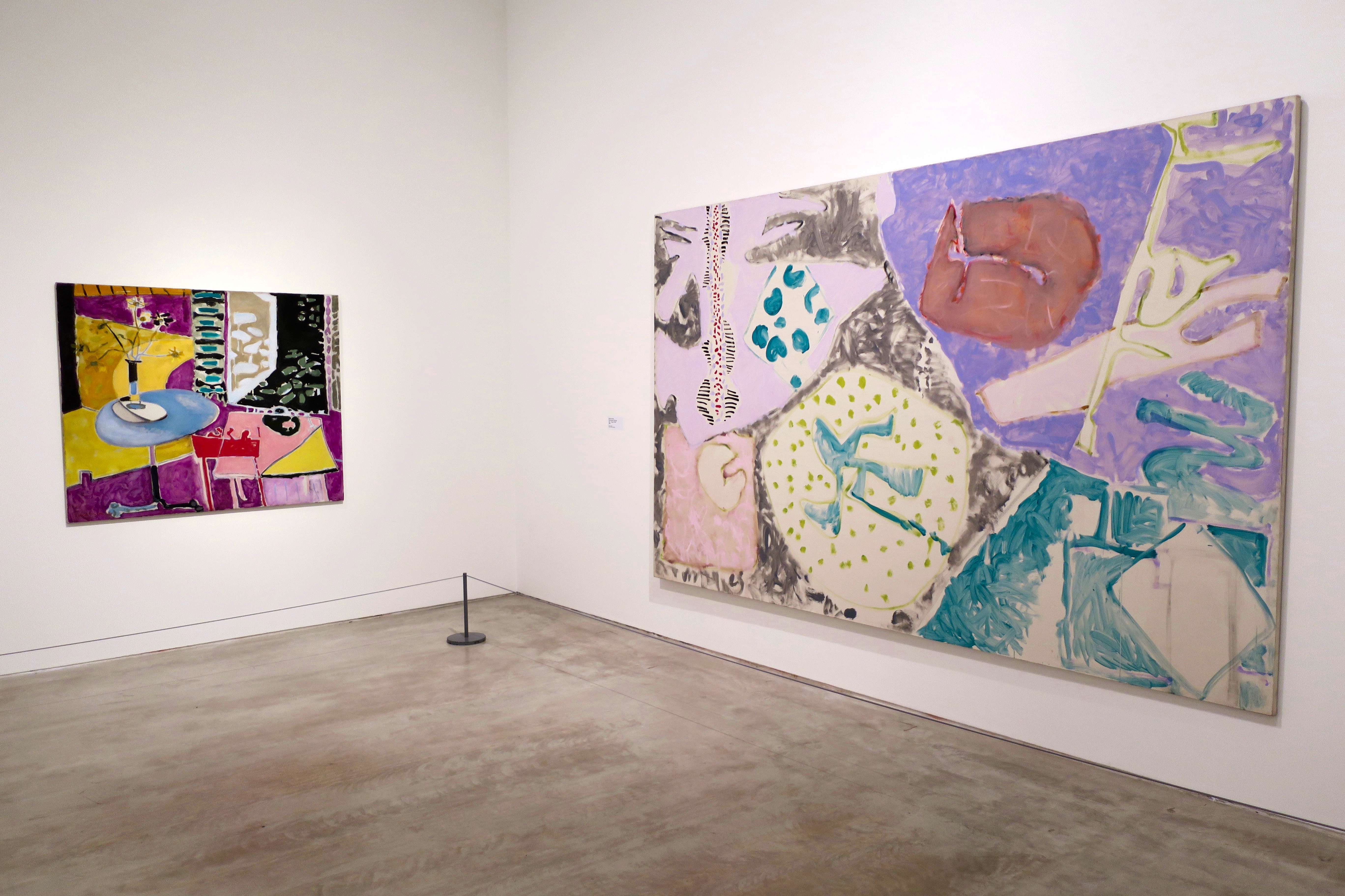
left – Interior with Garden Window: 1955
right – Pale Garden Painting: July – August 1984
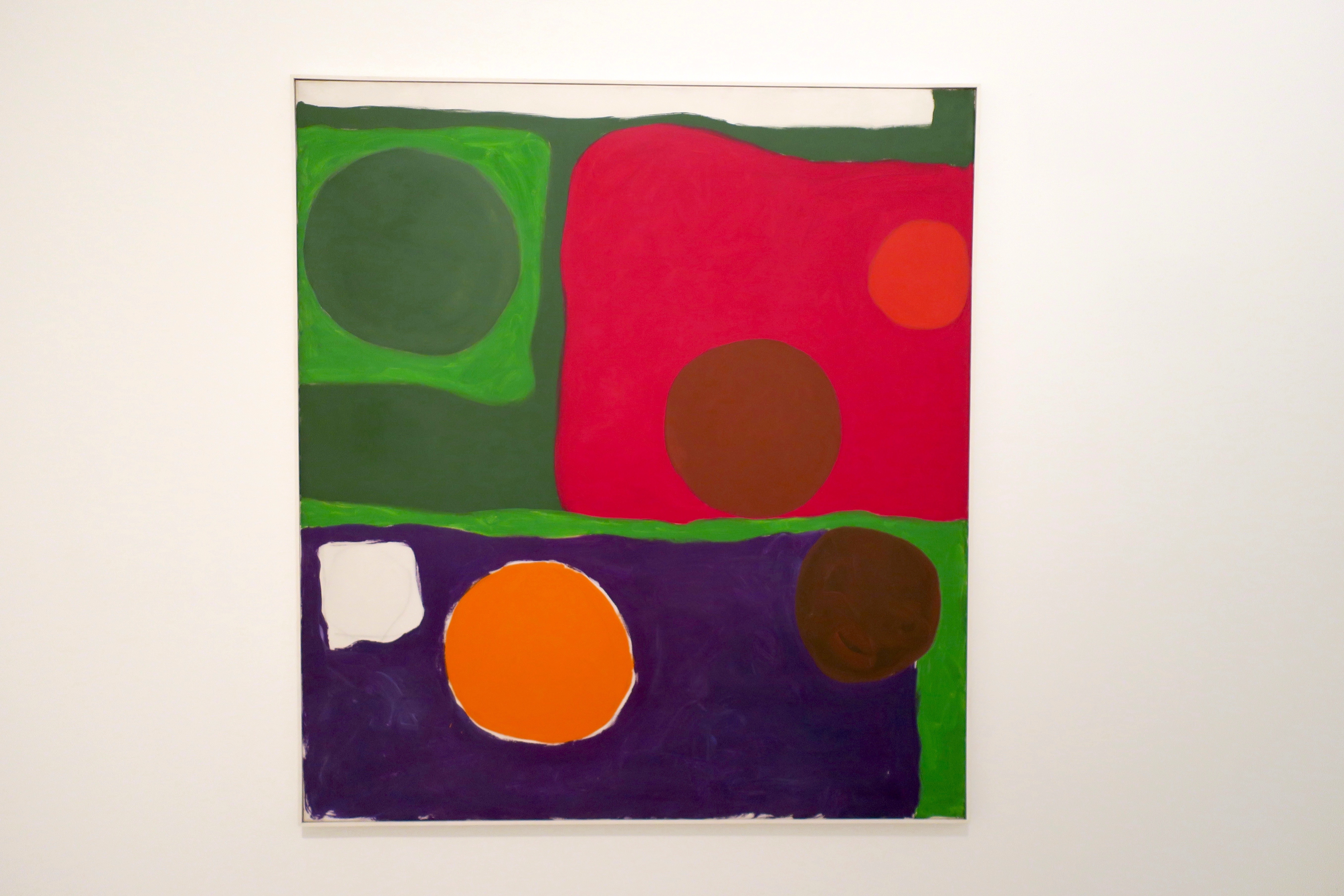
Five Discs: 1963
Camellia Garden: 1956
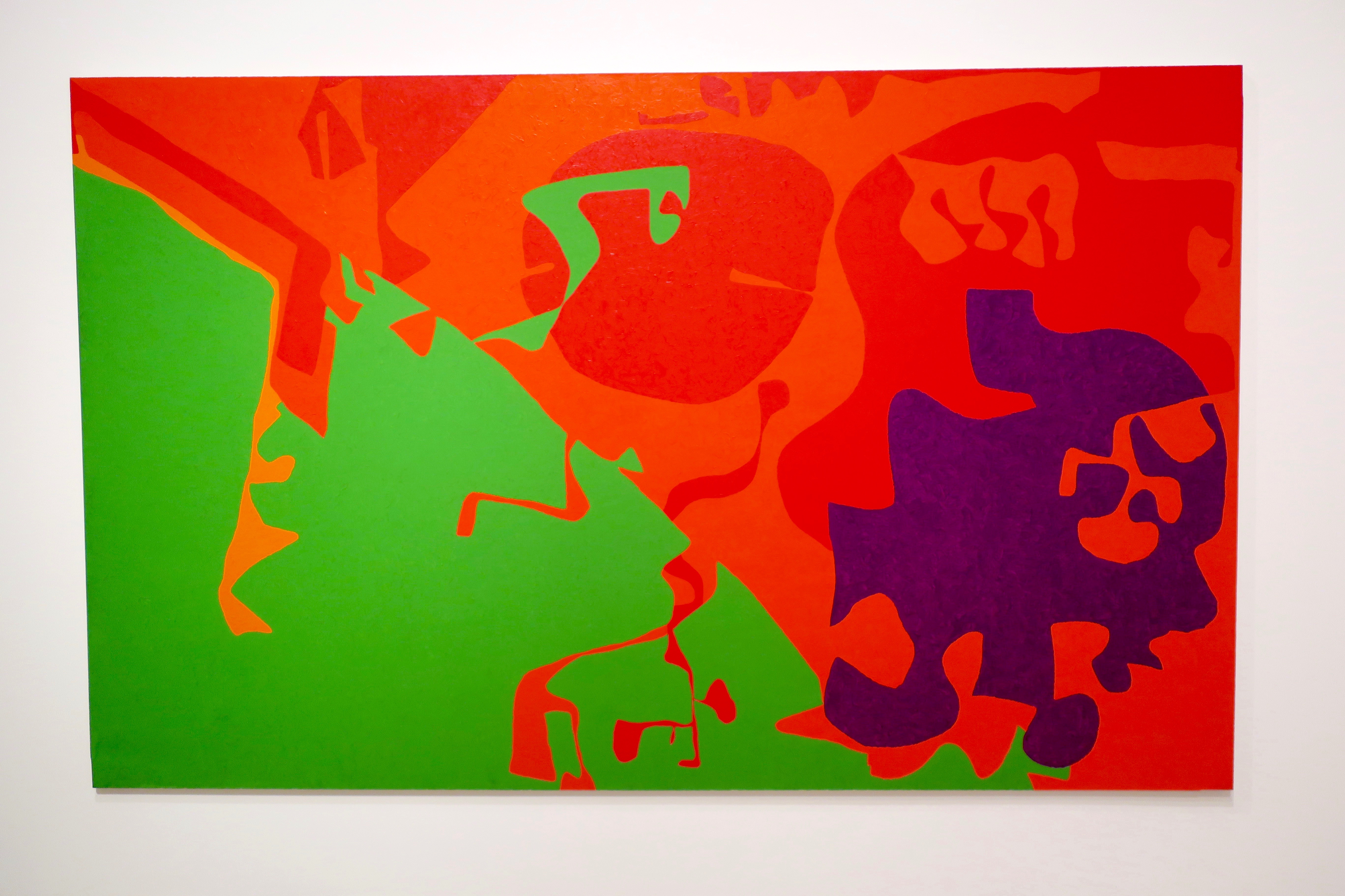
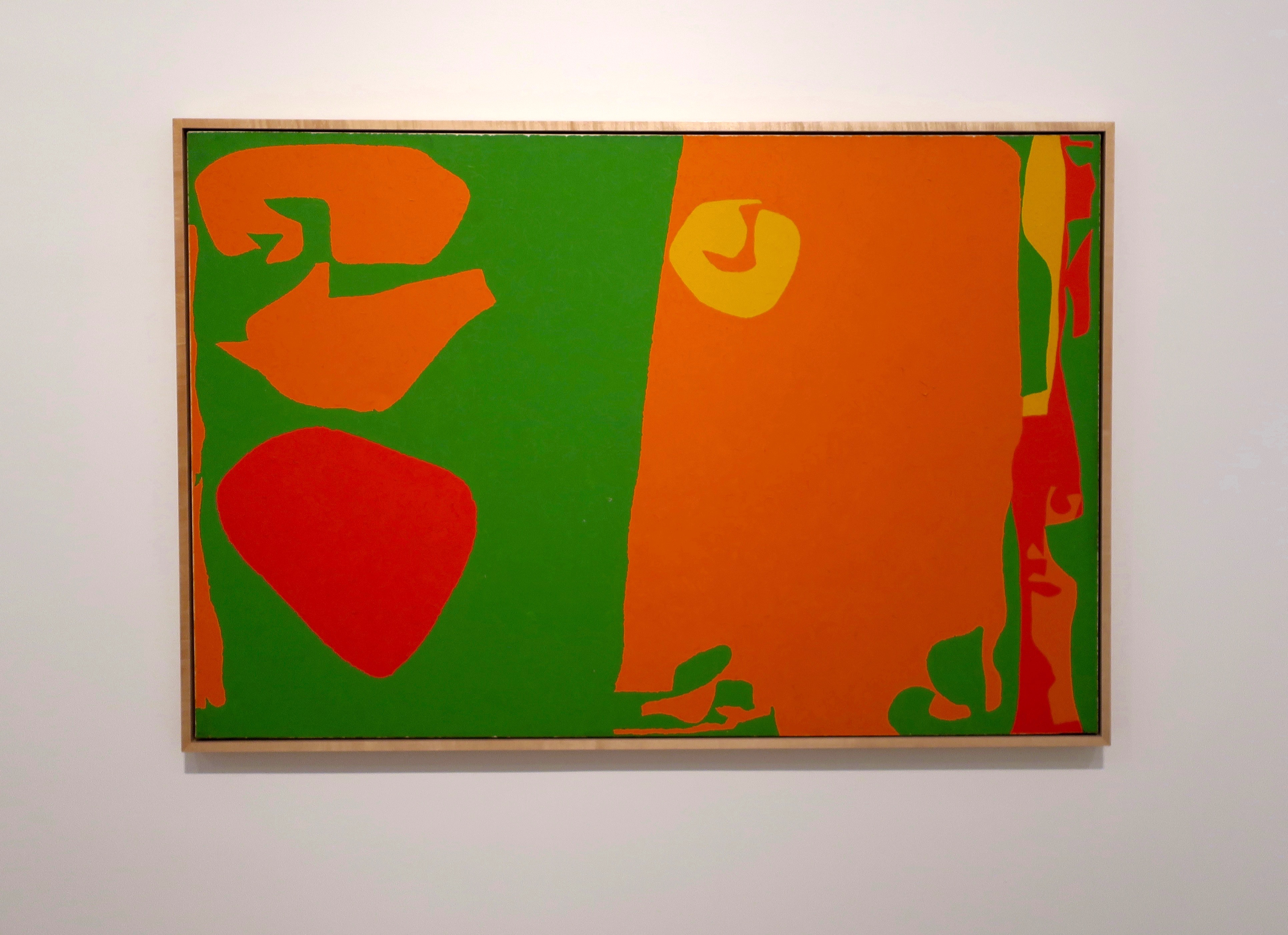
Big Complex Diagonal with Emerald and Reds: March 1972 – September 1974
“Painting should resolve asymmetric, unequal, disparate formal ingredients into a state of architectonic harmony which, while remaining asymmetrical, nevertheless constitutes a perfect state of balance, or equilibrium… The process of pictorial statement should involve an elaborate, intuitive adjustment and readjustment of initially warring and disparate elements, until they finally click into the condition of balance.”
Patrick Heron, 1969
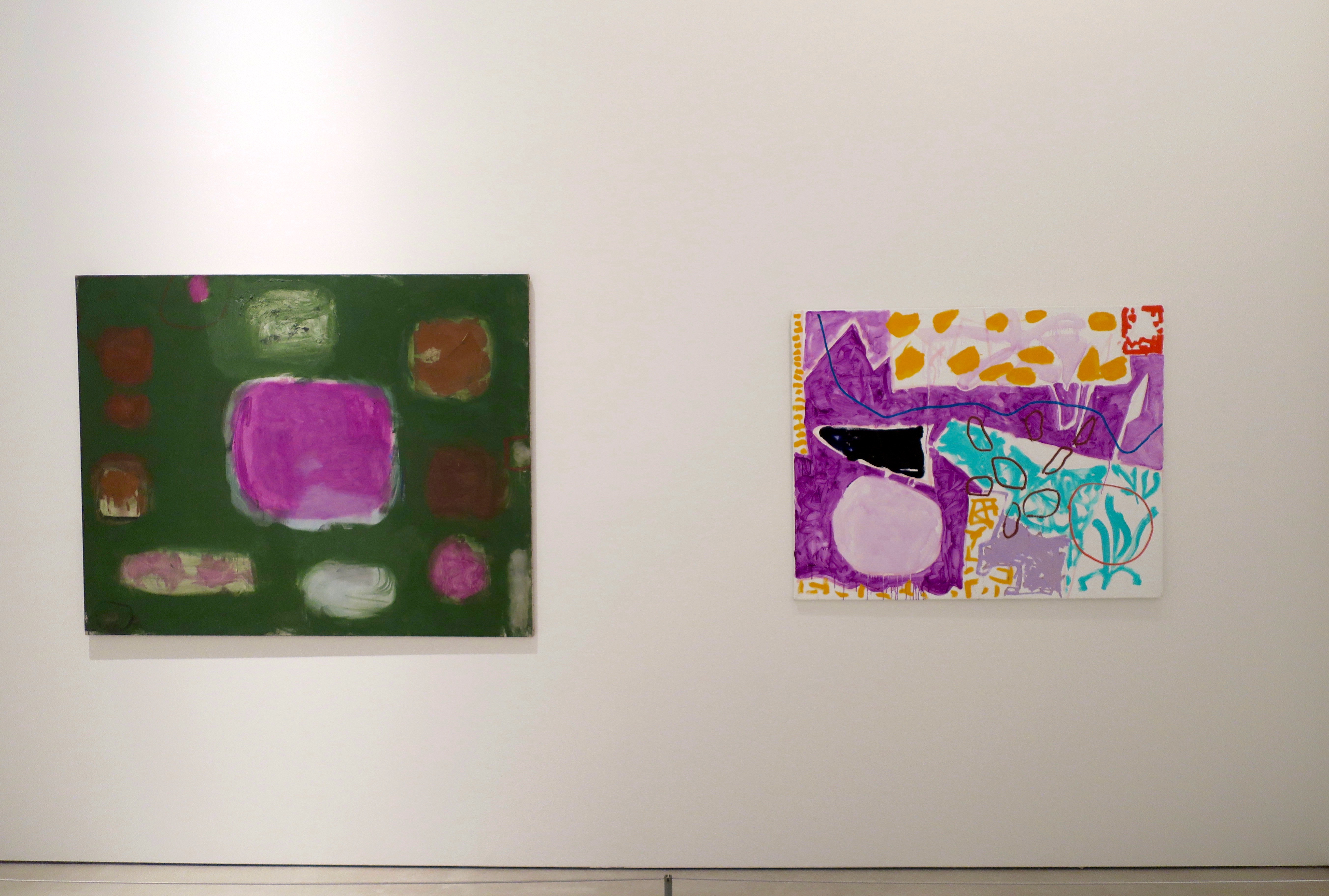
left – Violet in Dull Green: July 1959
right – 1-3 September: 1996
“The architecture of the canvas, the spatial interrelation of each and every touch (or stroke, or bar) of colour, the colour-character, the paint-character of a painting – all these I now explore with a sense of freedom quite denied me while I still had to keep half an eye on a ‘subject’.”
Patrick Heron, 1956
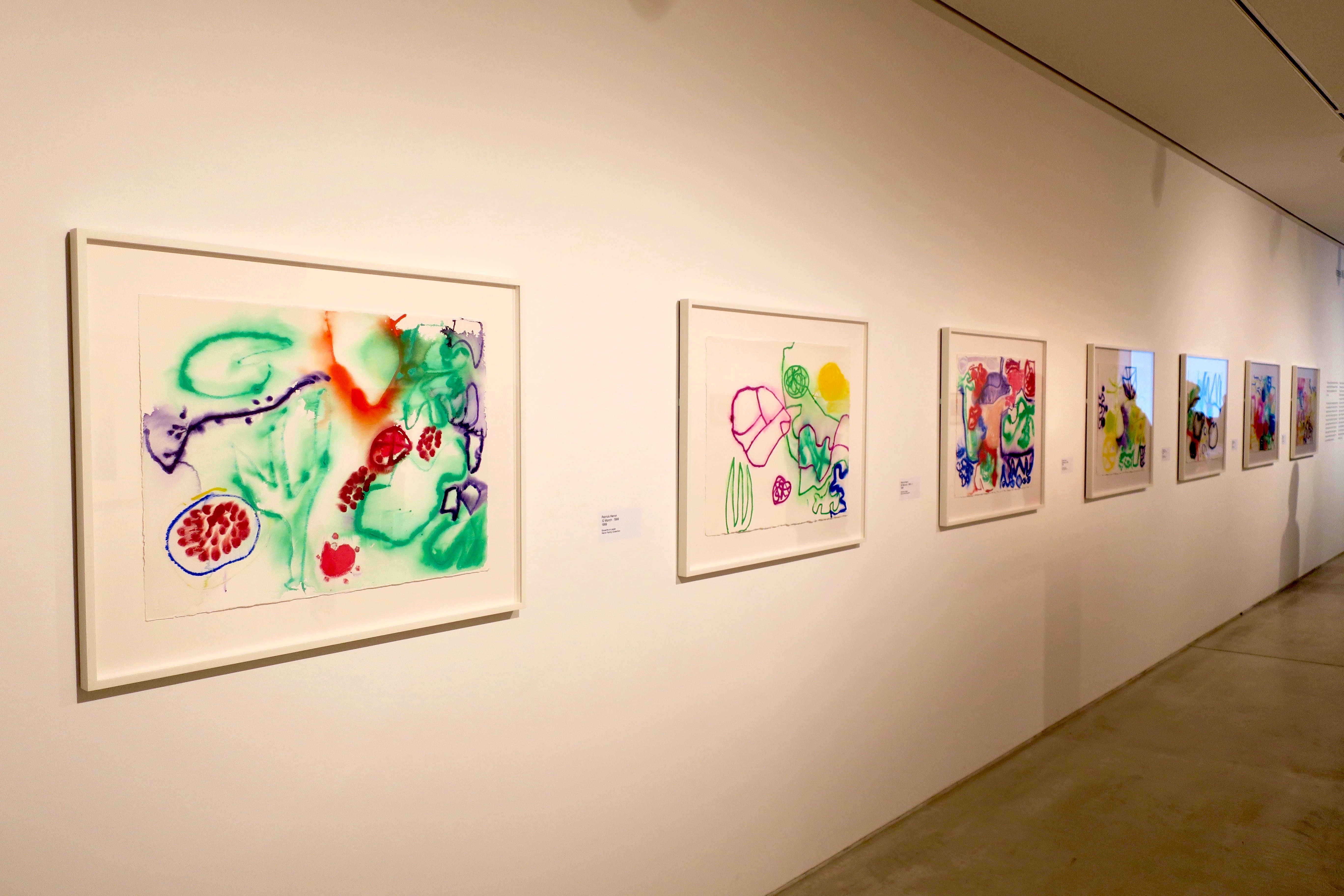
“This group of gouaches was made in February and March 1999, in the last weeks of Patrick Heron’s life, and are exhibited here for the first time.
“These vividly coloured paintings were produced in an extraordinary burst of creativity in the year following Heron’s major retrospective at Tate in 1998, after which he initially struggled to paint. Encouraged by his daughters to begin painting again, between November 1998 and March 1999 he produced a series of over forty modestly-scaled paintings. Heron’s very last gouaches however were larger in scale, allowing for an even greater liquidity and openness.
“Gouache, unlike watercolour, is opaque so the white surface of the paper does not show through. Heron had made gouaches since the 1960s but these late paintings represented a new approach. They combine abstract arrangements of vibrantly coloured lines and spots, creating areas of solid or pooled paint against expanses of white. The gouaches were painted in the small front room Heron used as a studio, overlooking the Atlantic coast and his garden, which was bursting with early spring colour. He painted flat on a table, using the tube of paint to draw directly onto paper, totally absorbed in observing and controlling how the colour ran.”
12 March: 1999
25 February: 1999: II
18 March: 1999
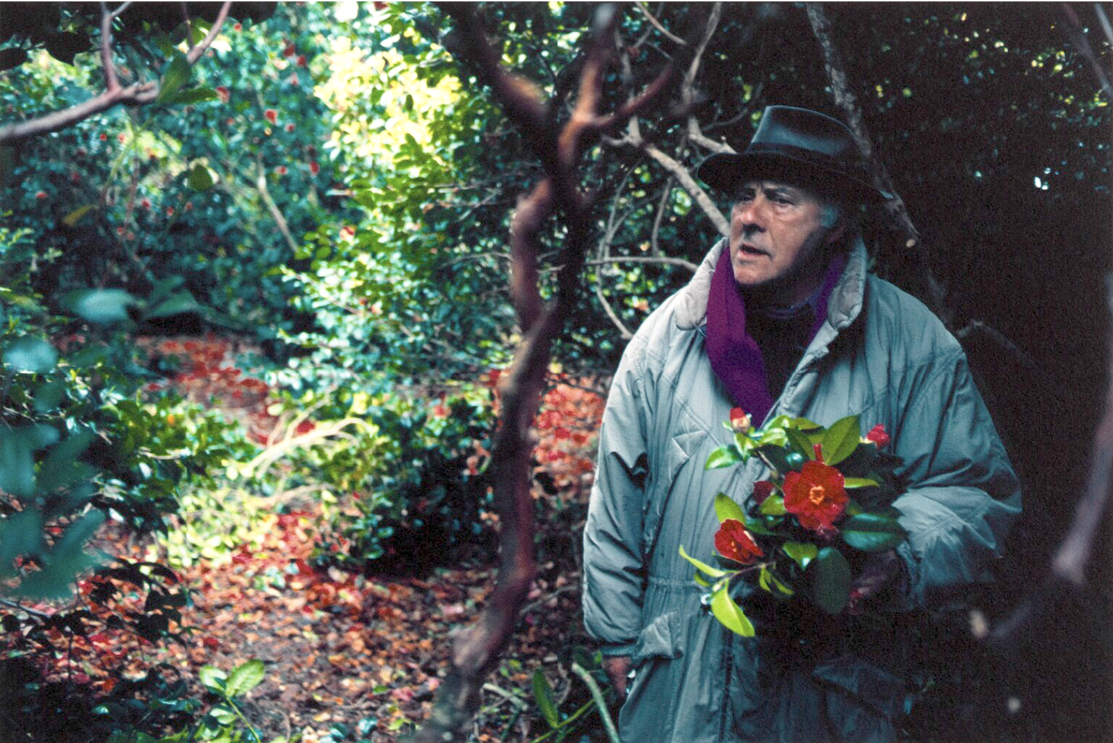
Patrick Heron’s studio, 5 Porthmeor Studios, St Ives, 1984
I met Patrick Heron just once, very briefly, in 1977. He was younger then than I am now. I was an MFA student and Terry Frost brought him and William Scott as external assessors to look at my final degree show. I remember his vividly coloured jumper and scarf and his high thin voice. I think he approved the vegetal tangle and the bright overlapping colours, the two aspects of my paintings that I never managed to reconcile. I should have looked more closely at his. I did take notice twenty years later. I saw his retrospective at the Tate Gallery in 1998 and loved his garden paintings, then later, not long after he died, I heard they were lost in a warehouse fire. So this exhibition in Margate seems like a fantastic reincarnation of beautiful timeless survivors by an artist who, the older he got, the younger his paintings became. These are just the most uplifting and inspiring and gobsmacking paintings. I careered through the exhibition like I was a pinball bouncing from one painting to another, gasping at every joyful revelation, eager for the next crazy mad smile on my face, happily grinning like a fool.
Portrait of Patrick Heron: John Hedgecoe, 1982
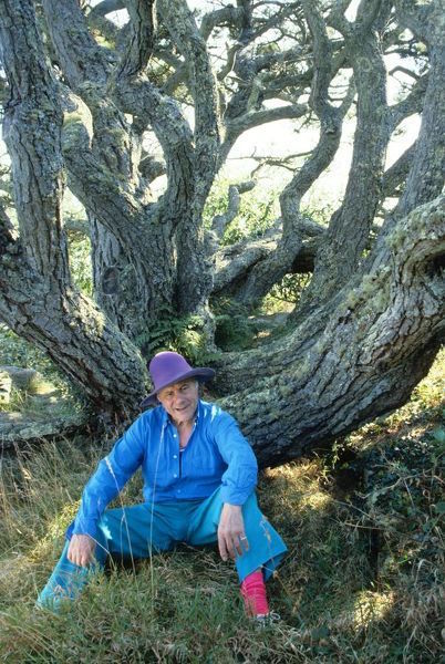
Patrick Heron in The Camellia Garden at Eagles Nest: Susanna Heron, 1998
※
Patrick Heron | Turner Contemporary

Wow! Thanks for taking us to the Heron show. Although Paula told me that you like him, I had not even heard of him – general ignorance of British non-objective painters who began working in the fifties and sixties. Reading a book by Martin Gayford (2018) entitled Modernists and Mavericks: Bacon, Freud, Hockney and the London Painters is helping enormously. He writes a lot about Heron and includes a bit about Bacon and Heron meeting when Bacon went to St. Ives.
Gayford includes a terrific quotation by Bridget Riley. When viewing some abstract in the late 1950s, she said, “Depth is part of painting, to deny it is to deny part of what painting is.” Well she sure found a way to be abstract and get depth.
Perpetual Canon by Cornelia Parker is also terrific. There is a piece of hers with crushed bass band instruments at the V&A, which is great.
You must have been ecstatic when you saw the portrait of Heron – a Great TREE and Heron.
I’m glad you enjoyed the show. And if you’re reading the Martin Gayford book you probably know more now about Patrick Heron than I do. But I know he was not afraid of colour and his paintings are always interesting in the ways coloured shapes meet each other. He could be painstaking in his application of paint, careful that one edge never overlapped another. I’m sure he hated masking tape. He always favoured handmade edges and it was never about geometry but always about looking. He found inspiration in the natural world and especially in his garden. Sue visited him in Cornwall, at his house in Zennor and at the studio on Porthmeor Beach in St Ives that he took over from Ben Nicholson (we adopted their method of picture hanging with batons on the walls at the Rowley Gallery). I saw a nice phrase he wrote about William Scott’s paintings – ‘the restless pulse of living things everywhere’ – which might just as well apply to his own.
“These are just the most uplifting and inspiring and gobsmacking paintings. I careered through the exhibition like I was a pinball bouncing from one painting to another, gasping at every joyful revelation, eager for the next crazy mad smile on my face, happily grinning like a fool”
A perfect summary of 3 visits i made to the st Ives exhibition, they are astonishingly beautiful and uplifting paintings.
Thanks Tony, kind of you to say. It was a lovely exhibition. And thanks for the link to your website, I really enjoyed looking at your work and watching you dance on the beach with the incoming tide.
For me as a Dutch painter, Patrick Heron is one the best abstract (‘neo impressionist’), together with Helen Frankenthaler, Willem De Kooning, and nowadays Andreas Erikson.
I’m sure his work is still inspiring young painters.