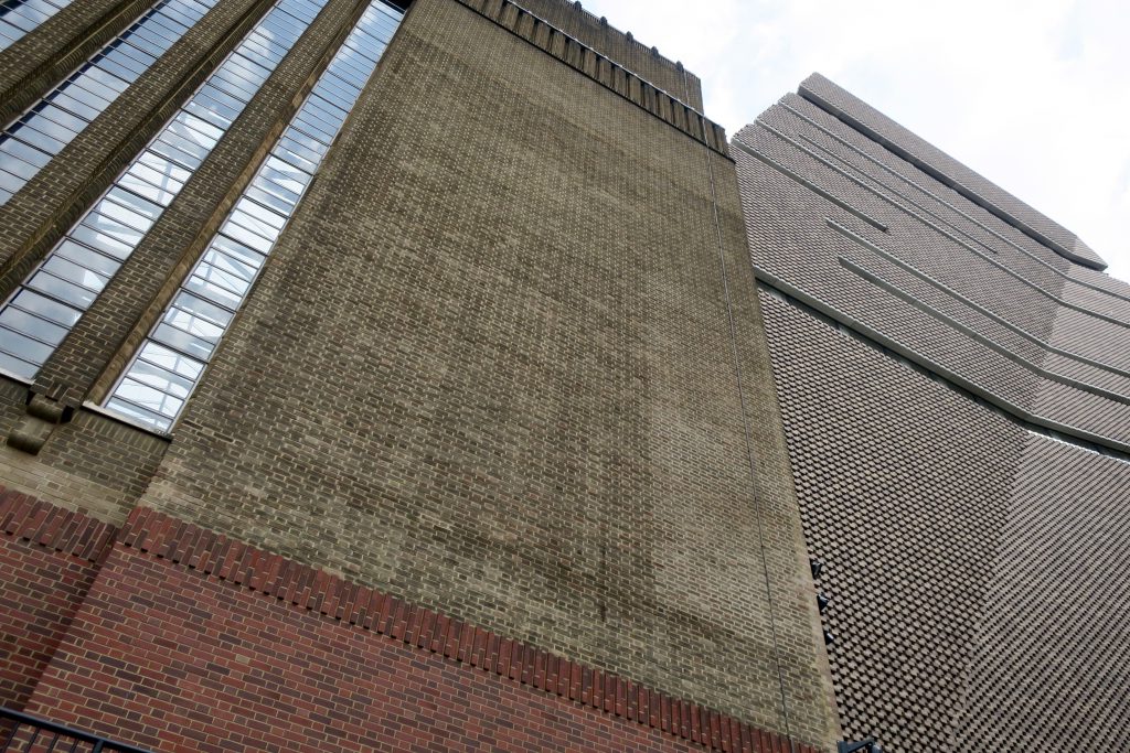
Tate Modern has a new offspring, grown out of the former power station’s oil tanks. It’s called the Switch House, with a similar tweedy brick texture to its parent building – a new London vernacular. It has a utilitarian look with no decorative frills, polished concrete inside, minimal, neo-brutalist, multi-storey car park aesthetic but beautifully tailored. In retrospect it feels a bit like we just visited an enormous new sculpture and discovered inside the seeds of its own germination. Continue reading “Between Object And Architecture”


