Last Christmas I was given two books that I found inspirational in different ways: Yotam Ottolenghi & Sami Tamimi’s Jerusalem and Simon Sebag Montefiore’s Jerusalem the Biography.
To summarise briefly, the first book has become my cooking bible, and is a testament to inspirational cooperation between Israelis and Palestinians, and the second book reveals the city’s complex history and the sources of controversy that have plagued her continuously.
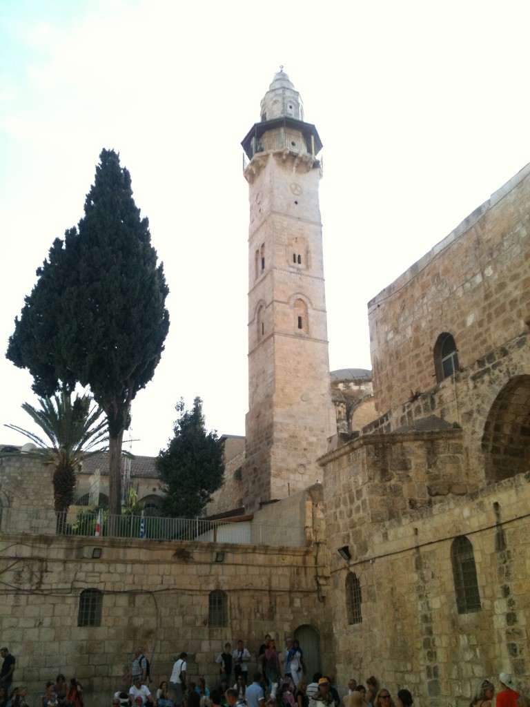
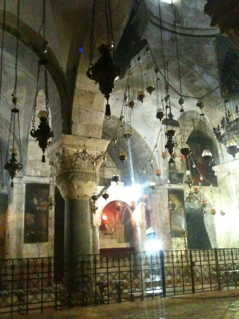
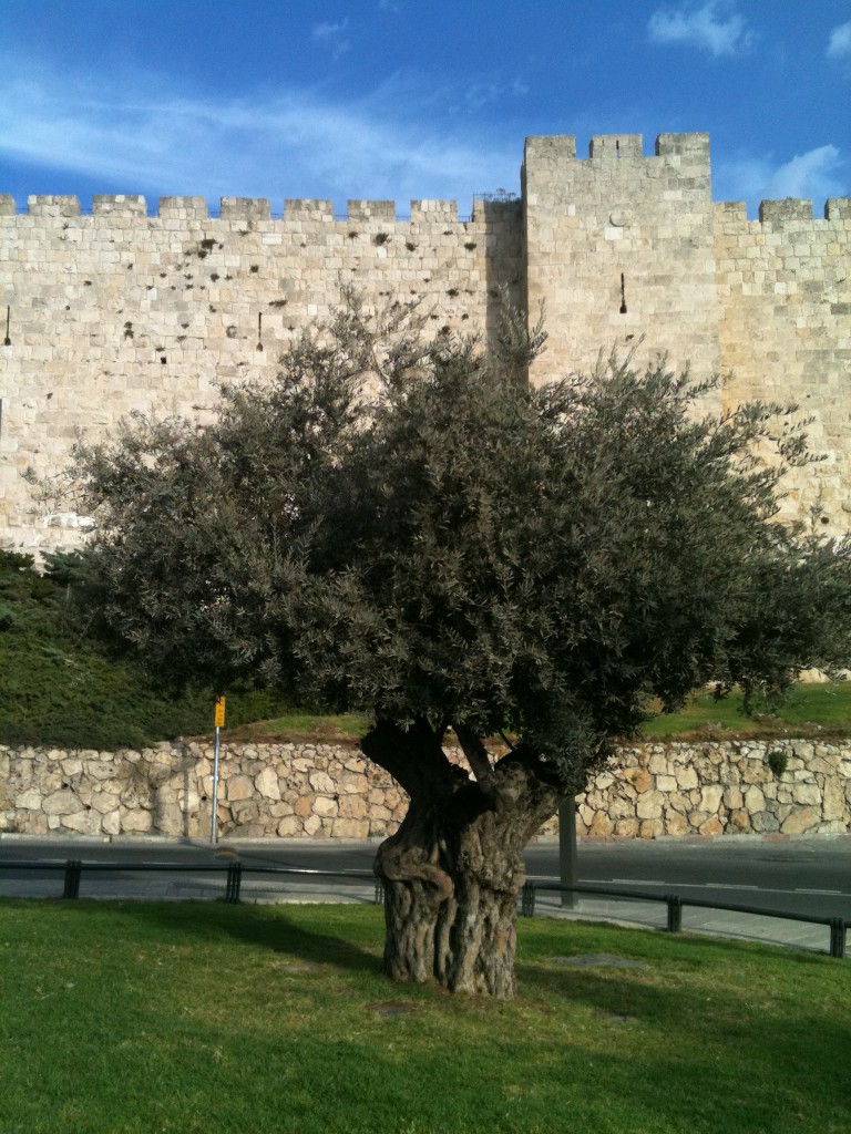
On a recent visit to Jerusalem with my family we witnessed at close quarters the diversity of cultures in this fascinating place and both books came to life. I sought to express the layered assemblage of cultures there in my own art form and this gave birth to Jerusalem, Topography & Typography.
Maps express a wide range and detail of information efficiently and in a form which I find beautiful, and I have used them to convey Jerusalem’s sense of place which is at the centre of its epic history. As Sebag Montefiore’s eloquent preface sets out to investigate: “How did this small, remote town become the Holy City, the ‘centre of the world’ and now the key to peace in the Middle East?”
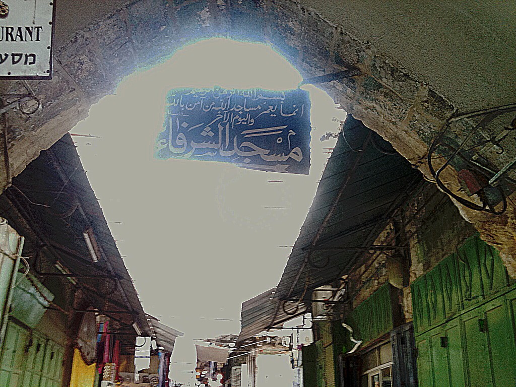
Social and cultural expression often takes the written form, with illuminated manuscripts characterising traditional arts in both Jewish and Islamic cultures. I incorporated the typography of the different languages as a contemporary and contrasting symbol of such expression.
My tessellated origami enabled me to inter-weave all these elements to create an artwork placing Jerusalem at its centre, intriguing and inviting closer examination of the diverse details, in sharp contrast to the calm Mediterranean coast line to its west. Please click on the image for a closer look.
Hedy Parry-Davies / The Rowley Gallery


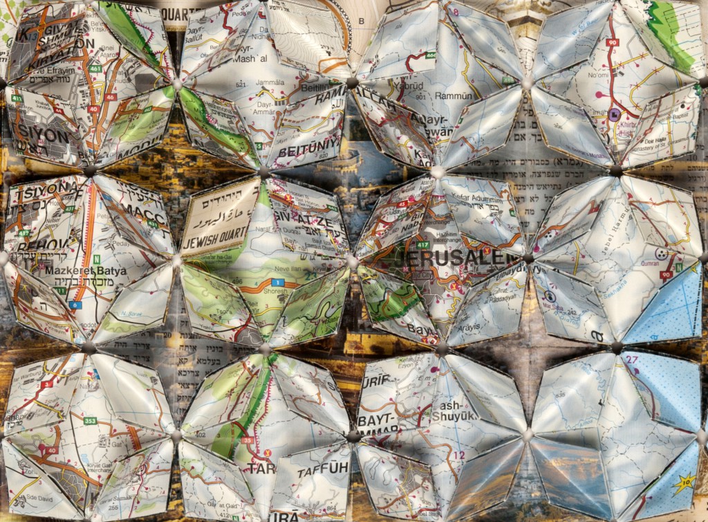
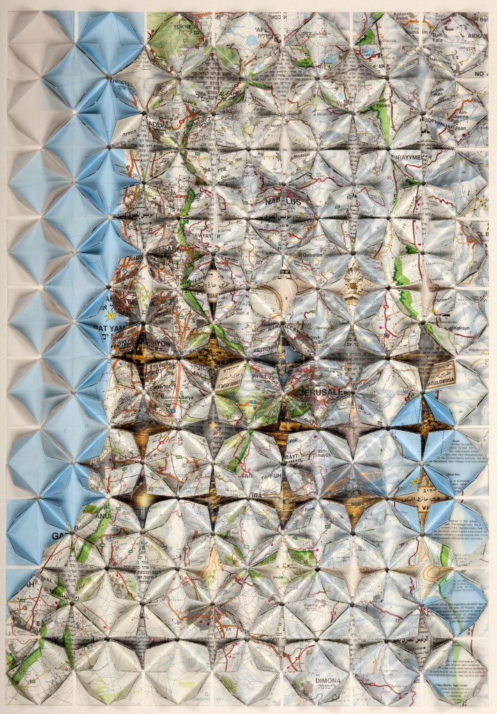
Hmm I’m not sure why but while I was looking at the image more closely I started thinking of both volcanoes and flowers, not something which usually go together – in fact quite awkward. But maybe this sums it up. It feels lovely and intricate and the reflected light is beautiful.
Thanks! That was a very interesting and observant comment. It shows that the three-dimensional quality of the artwork enhances the topographical aspect of the subject matter. But it also takes a life of its own. I’m glad you liked it!
Beautiful art work!