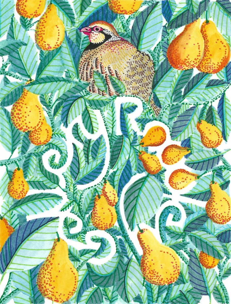
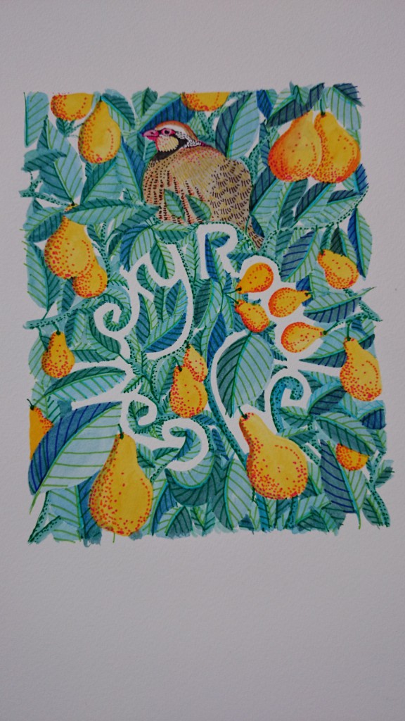
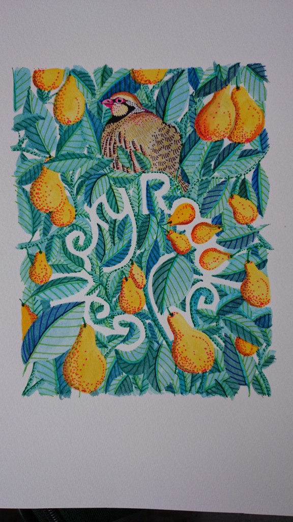
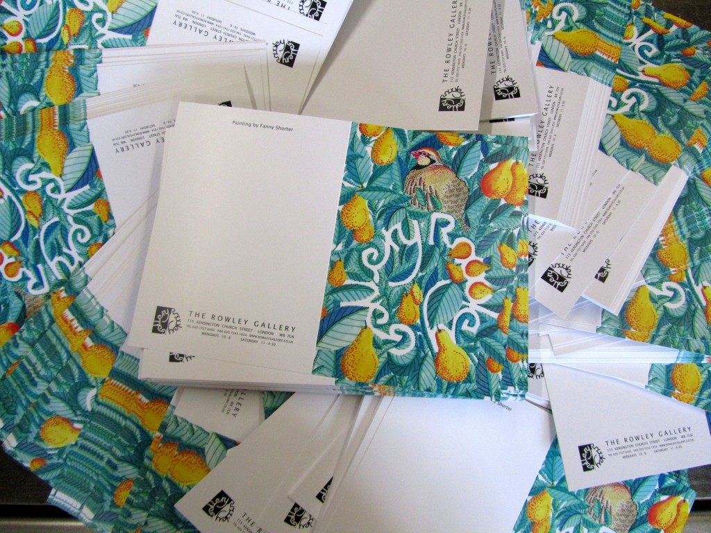
I’m not going to pretend a partridge in a pear tree is the most original of Christmas card ideas but I had been drawing a lot of birds and a lot of fruit and it did fit the brief rather nicely so I didn’t drift too far for inspiration.
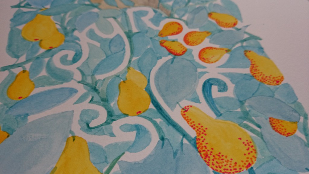
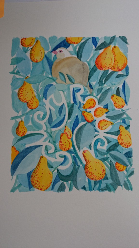
In order to avoid any sort of a corporate look (I wouldn’t have got very far with that anyway) I wanted the logo to be the second thing you noticed when you looked at the illustration so decided to use the negative space between the pears and leaves to create the shape of the letters.
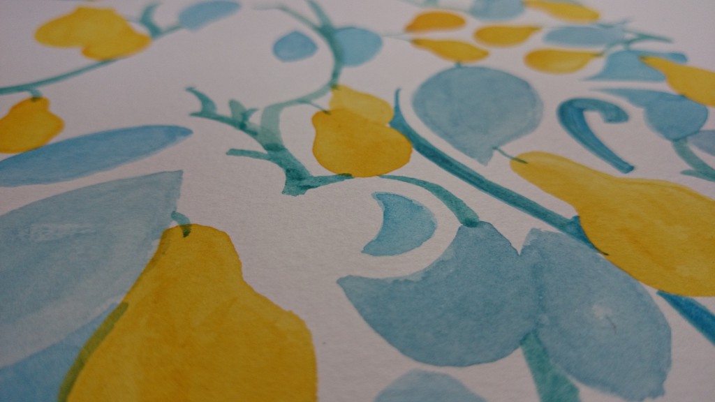
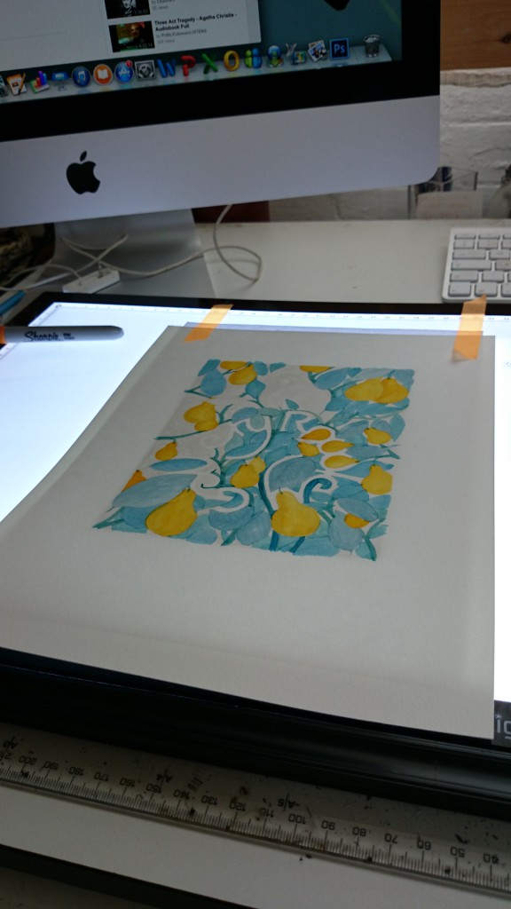
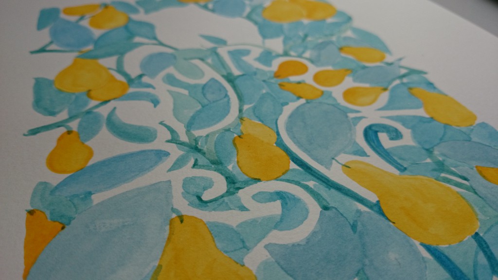
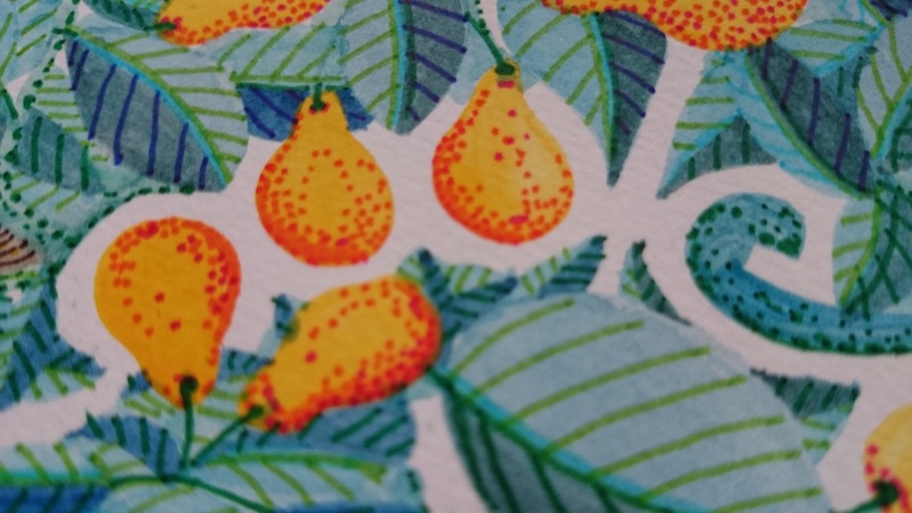
It was tricky to get the balance right between keeping it subtle but readable. I wasn’t able to screen print the image but wanted to create a similar feel as it is the medium I usually use so I used flat layers of watercolour to build up the picture and then worked the details in with coloured pens.
Fanny Shorter / The Rowley Gallery


A few years ago I came across Ben Shahn’s “A Partridge in a Pear Tree”. MOMA New York published it just post war about 1948. I have searched on line for the double page spread with words on the left & image on the right. I was unable to find this but here is something.
Beautifully done. Love the colors too.